Your graphics add a nice touch to my presentations and I recently used them for one of my all-hands meetings. Your toolbox adds professionalism to my slides. Instead of using standard clipart.
Claude Jones, Director of Engineer, @Walmartlabs, USA
Your graphics add a nice touch to my presentations and I recently used them for one of my all-hands meetings. Your toolbox adds professionalism to my slides. Instead of using standard clipart.
Claude Jones, Director of Engineer, @Walmartlabs, USA
I needed a fresh look at some of my slides. I've tried to find a way to create a paintbrush effect, to underline, accentuate, add some color and the handwritten markers were just the things. Very easy to use, easy to size, change the color. It was an affordable, perfect solution and I'm happy to recommend it.
Anonymous, US
The crisp, clean look of the graphics, and the fact that it allowed me to easily edit and change the colors to match the template was my main reason for purchasing them.
Brandie Jenkins, E-learning Developer, USA
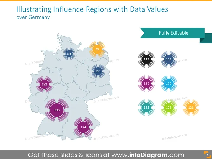
The PowerPoint slide presents data values for different influence regions over Germany. A map of Germany is used to display various regions with numerical data tagged to specific locations. The numbers likely represent some quantitative measure, such as sales volume, population, or performance metrics. They vary in sizes, denoting the magnitude or importance of the values. The surrounding circles with different colors indicate the range or influence area of each value, providing a visual representation of impact or relevance.
The overall look of the slide is professional and modern, with a clear visual hierarchy that makes it easy to interpret the data at a glance. The use of color-coding helps in distinguishing different regions and the data points associated with them.


