Your graphics add a nice touch to my presentations and I recently used them for one of my all-hands meetings. Your toolbox adds professionalism to my slides. Instead of using standard clipart.
Claude Jones, Director of Engineer, @Walmartlabs, USA
Your graphics add a nice touch to my presentations and I recently used them for one of my all-hands meetings. Your toolbox adds professionalism to my slides. Instead of using standard clipart.
Claude Jones, Director of Engineer, @Walmartlabs, USA
I needed a fresh look at some of my slides. I've tried to find a way to create a paintbrush effect, to underline, accentuate, add some color and the handwritten markers were just the things. Very easy to use, easy to size, change the color. It was an affordable, perfect solution and I'm happy to recommend it.
Anonymous, US
The crisp, clean look of the graphics, and the fact that it allowed me to easily edit and change the colors to match the template was my main reason for purchasing them.
Brandie Jenkins, E-learning Developer, USA
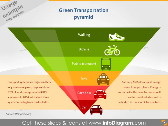
The slide depicts a green transportation pyramid, categorizing different modes of transport based on their environmental impact. Walking represents the most eco-friendly option, followed by bicycle and public transport, highlighting sustainable choices. Taxis and carpools are placed in the middle, suggesting moderate environmental impact. The car is at the bottom, indicating the highest ecological footprint. The referenced data notes transport systems as major greenhouse gas emitters and the predominant reliance on petroleum for transport energy.
The pyramid is designed with a gradient of colors from green at the top, signifying the most environmentally friendly modes, to red at the bottom for the least sustainable. The strategic use of color-coding and icons makes the message immediately clear and visually engaging.


