Your graphics add a nice touch to my presentations and I recently used them for one of my all-hands meetings. Your toolbox adds professionalism to my slides. Instead of using standard clipart.
Claude Jones, Director of Engineer, @Walmartlabs, USA
Your graphics add a nice touch to my presentations and I recently used them for one of my all-hands meetings. Your toolbox adds professionalism to my slides. Instead of using standard clipart.
Claude Jones, Director of Engineer, @Walmartlabs, USA
I needed a fresh look at some of my slides. I've tried to find a way to create a paintbrush effect, to underline, accentuate, add some color and the handwritten markers were just the things. Very easy to use, easy to size, change the color. It was an affordable, perfect solution and I'm happy to recommend it.
Anonymous, US
The crisp, clean look of the graphics, and the fact that it allowed me to easily edit and change the colors to match the template was my main reason for purchasing them.
Brandie Jenkins, E-learning Developer, USA
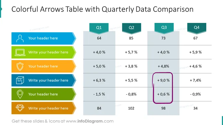
The slide titled "Colorful Arrows Table with Quarterly Data Comparison" presents data across four quarters, Q1 to Q4, for five categories, each with a unique colored arrow and icon. The first category shows growth percentages for each quarter, the second indicates a similar trend. One category, highlighted by a purple drawn rectangle, shows a significant +9.0% growth in Q3. Another category indicates a negative trend, and the last shows absolute values, emphasizing a large figure of 102 in Q3.
The overall design is modern, with an emphasis on clarity and readability. The use of icons and colors helps to distinguish different categories at a glance.


