Your graphics add a nice touch to my presentations and I recently used them for one of my all-hands meetings. Your toolbox adds professionalism to my slides. Instead of using standard clipart.
Claude Jones, Director of Engineer, @Walmartlabs, USA
Your graphics add a nice touch to my presentations and I recently used them for one of my all-hands meetings. Your toolbox adds professionalism to my slides. Instead of using standard clipart.
Claude Jones, Director of Engineer, @Walmartlabs, USA
I needed a fresh look at some of my slides. I've tried to find a way to create a paintbrush effect, to underline, accentuate, add some color and the handwritten markers were just the things. Very easy to use, easy to size, change the color. It was an affordable, perfect solution and I'm happy to recommend it.
Anonymous, US
The crisp, clean look of the graphics, and the fact that it allowed me to easily edit and change the colors to match the template was my main reason for purchasing them.
Brandie Jenkins, E-learning Developer, USA
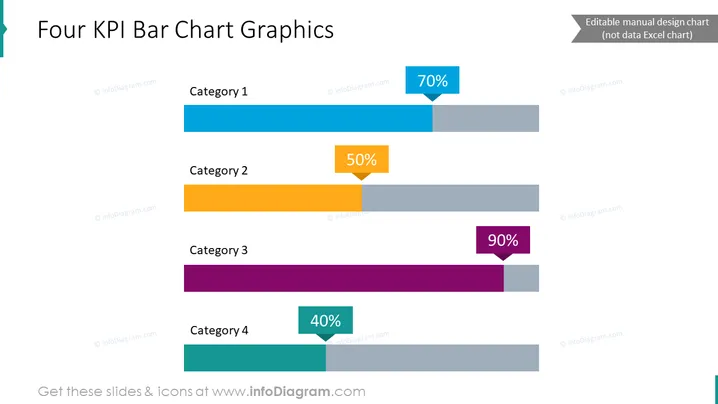
The PowerPoint slide presents a "Four KPI Bar Chart Graphics" layout, which utilizes bar charts to display key performance indicators (KPIs) for four distinct categories. Each bar is associated with a category labeled Category 1 through 4, illustrating performance percentages of 70%, 50%, 90%, and 40% respectively. KPIs are vital metrics used to evaluate the success in achieving primary business objectives, aiding in performance assessment and guiding strategic planning.
The slide has a clean and modern look with a color-coded scheme to differentiate between the categories. The design is simple and focused, making the data easy to interpret at a glance.


