Your graphics add a nice touch to my presentations and I recently used them for one of my all-hands meetings. Your toolbox adds professionalism to my slides. Instead of using standard clipart.
Claude Jones, Director of Engineer, @Walmartlabs, USA
Your graphics add a nice touch to my presentations and I recently used them for one of my all-hands meetings. Your toolbox adds professionalism to my slides. Instead of using standard clipart.
Claude Jones, Director of Engineer, @Walmartlabs, USA
I needed a fresh look at some of my slides. I've tried to find a way to create a paintbrush effect, to underline, accentuate, add some color and the handwritten markers were just the things. Very easy to use, easy to size, change the color. It was an affordable, perfect solution and I'm happy to recommend it.
Anonymous, US
The crisp, clean look of the graphics, and the fact that it allowed me to easily edit and change the colors to match the template was my main reason for purchasing them.
Brandie Jenkins, E-learning Developer, USA
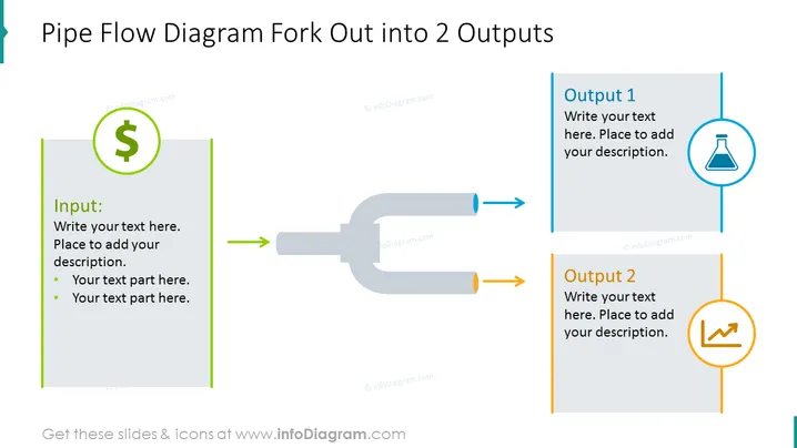
This slide represents a process flow diagram where a single input forks into two different outputs. The input is represented by a box with a dollar sign icon, suggesting a financial resource or investment. The outputs are labeled 'Output 1' and 'Output 2', each with a unique icon – a laboratory flask for Output 1 indicating perhaps a research or scientific result, and a graph for Output 2 suggesting a data-driven outcome or report. This diagram visually conveys the division or allocation of resources or efforts from a singular source to multiple distinct results or areas.
The overall look of the slide is sleek and professional, with a clear visual hierarchy that makes understanding the flow of information intuitive. The use of distinct colors for different elements aids in distinguishing separate pathways.


