Your graphics add a nice touch to my presentations and I recently used them for one of my all-hands meetings. Your toolbox adds professionalism to my slides. Instead of using standard clipart.
Claude Jones, Director of Engineer, @Walmartlabs, USA
Your graphics add a nice touch to my presentations and I recently used them for one of my all-hands meetings. Your toolbox adds professionalism to my slides. Instead of using standard clipart.
Claude Jones, Director of Engineer, @Walmartlabs, USA
I needed a fresh look at some of my slides. I've tried to find a way to create a paintbrush effect, to underline, accentuate, add some color and the handwritten markers were just the things. Very easy to use, easy to size, change the color. It was an affordable, perfect solution and I'm happy to recommend it.
Anonymous, US
The crisp, clean look of the graphics, and the fact that it allowed me to easily edit and change the colors to match the template was my main reason for purchasing them.
Brandie Jenkins, E-learning Developer, USA
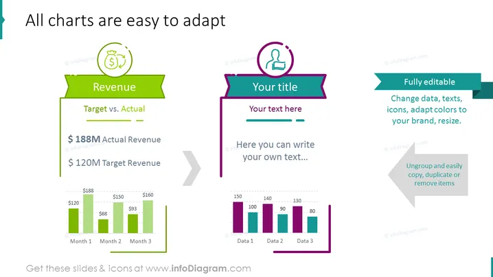
This PowerPoint slide introduces the concept of adaptable charts with examples displaying "Revenue" comparison between target and actual figures, along with a placeholder section for "Your title" and custom text. The Revenue section shows a bar chart comparing monthly target revenue against actual revenue, indicating an outperformance with $188M in actual revenue over a $120M target. The other side suggests customizability and is meant for user input.
The slide is visually balanced, with vibrant colors and clearly demarcated sections for financial data and user customization. Icons and banners are used to create a visual hierarchy and draw attention to key areas of the slide.


