Your graphics add a nice touch to my presentations and I recently used them for one of my all-hands meetings. Your toolbox adds professionalism to my slides. Instead of using standard clipart.
Claude Jones, Director of Engineer, @Walmartlabs, USA
Your graphics add a nice touch to my presentations and I recently used them for one of my all-hands meetings. Your toolbox adds professionalism to my slides. Instead of using standard clipart.
Claude Jones, Director of Engineer, @Walmartlabs, USA
I needed a fresh look at some of my slides. I've tried to find a way to create a paintbrush effect, to underline, accentuate, add some color and the handwritten markers were just the things. Very easy to use, easy to size, change the color. It was an affordable, perfect solution and I'm happy to recommend it.
Anonymous, US
The crisp, clean look of the graphics, and the fact that it allowed me to easily edit and change the colors to match the template was my main reason for purchasing them.
Brandie Jenkins, E-learning Developer, USA
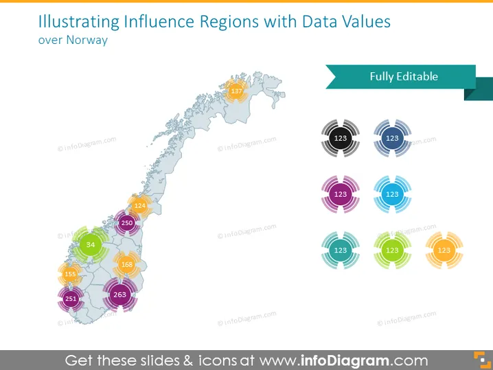
The slide presents a geographical data visualization concept, using the map of Norway to demonstrate how different regions are influenced by certain data values. Each region on the map is marked with a vibrantly colored, semi-transparent blotch, with corresponding numbers indicating specific data points. The color-coded blotches signify different influence regions, and likely represent varied datasets or metrics, such as population, sales volume, or other region-specific statistics, allowing for a visual comparison across the country.
The slide has a clean and modern look, with an emphasis on color coding to distinguish between data sets. Visual elements are arranged to create balance, with graphical data representations on the left and a legend or key on the right.


