Your graphics add a nice touch to my presentations and I recently used them for one of my all-hands meetings. Your toolbox adds professionalism to my slides. Instead of using standard clipart.
Claude Jones, Director of Engineer, @Walmartlabs, USA
Your graphics add a nice touch to my presentations and I recently used them for one of my all-hands meetings. Your toolbox adds professionalism to my slides. Instead of using standard clipart.
Claude Jones, Director of Engineer, @Walmartlabs, USA
I needed a fresh look at some of my slides. I've tried to find a way to create a paintbrush effect, to underline, accentuate, add some color and the handwritten markers were just the things. Very easy to use, easy to size, change the color. It was an affordable, perfect solution and I'm happy to recommend it.
Anonymous, US
The crisp, clean look of the graphics, and the fact that it allowed me to easily edit and change the colors to match the template was my main reason for purchasing them.
Brandie Jenkins, E-learning Developer, USA
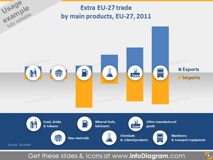
The slide presents a bar chart comparing Extra-EU-27 trade by main products in 2011, illustrating the balance between exports (in blue) and imports (in orange) for six categories. "Food, drinks & tobacco" suggests consumable goods, "Raw materials" indicate foundational industrial inputs, "Mineral fuels, lubricants" encompass energy commodities, "Chemicals & related products" involve chemical exports/imports, "Other manufactured goods" could mean various finished products, and "Machinery & transport equipment" likely refers to heavy industry outputs.
The overall look of the slide is clean and modern, with a focus on visual comparison through contrasting colors. The design is simple and clear, making it easy to interpret the data at a glance.


