Your graphics add a nice touch to my presentations and I recently used them for one of my all-hands meetings. Your toolbox adds professionalism to my slides. Instead of using standard clipart.
Claude Jones, Director of Engineer, @Walmartlabs, USA
Your graphics add a nice touch to my presentations and I recently used them for one of my all-hands meetings. Your toolbox adds professionalism to my slides. Instead of using standard clipart.
Claude Jones, Director of Engineer, @Walmartlabs, USA
I needed a fresh look at some of my slides. I've tried to find a way to create a paintbrush effect, to underline, accentuate, add some color and the handwritten markers were just the things. Very easy to use, easy to size, change the color. It was an affordable, perfect solution and I'm happy to recommend it.
Anonymous, US
The crisp, clean look of the graphics, and the fact that it allowed me to easily edit and change the colors to match the template was my main reason for purchasing them.
Brandie Jenkins, E-learning Developer, USA
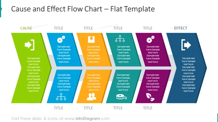
The slide is intended to present a cause and effect relationship via a flow chart. There are eight sections, each containing a title and sample text - four on each side implying a progression from "CAUSE" to "EFFECT". The titles and text are placeholders, suggesting that these sections can be customized to present specific information regarding factors leading to a particular result or outcome. Each block represents one step or factor in the process and the arrows demonstrate the transition and direction of the flow.
The slide has a very modern and clean design with contrasting colors to distinguish between cause and effect areas. This high-contrast, minimalistic design is visually engaging and simplifies complex processes for easier understanding.


