Your graphics add a nice touch to my presentations and I recently used them for one of my all-hands meetings. Your toolbox adds professionalism to my slides. Instead of using standard clipart.
Claude Jones, Director of Engineer, @Walmartlabs, USA
Your graphics add a nice touch to my presentations and I recently used them for one of my all-hands meetings. Your toolbox adds professionalism to my slides. Instead of using standard clipart.
Claude Jones, Director of Engineer, @Walmartlabs, USA
I needed a fresh look at some of my slides. I've tried to find a way to create a paintbrush effect, to underline, accentuate, add some color and the handwritten markers were just the things. Very easy to use, easy to size, change the color. It was an affordable, perfect solution and I'm happy to recommend it.
Anonymous, US
The crisp, clean look of the graphics, and the fact that it allowed me to easily edit and change the colors to match the template was my main reason for purchasing them.
Brandie Jenkins, E-learning Developer, USA
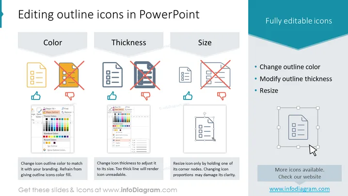
The slide presents information about customizing outline icons in PowerPoint, emphasizing the he options to change outline color, thickness, and size to enhance presentations. "Color" references matching icon color to branding while cautioning against filling icons, "Thickness" suggests adjusting line weight for readability and aesthetic match, and "Size" advises resizing with corner handles to maintain proportionality. Each of these concepts contributes to coherent graphic design within a presentation, helping to maintain visual consistency and the effective conveyance of intended messages.
The slide has a very clean and professional look, using contrasting colors smartly to highlight key points. The visual elements such as icons and interface screenshots are well-organized, directly supporting the text.


