Your graphics add a nice touch to my presentations and I recently used them for one of my all-hands meetings. Your toolbox adds professionalism to my slides. Instead of using standard clipart.
Claude Jones, Director of Engineer, @Walmartlabs, USA
Your graphics add a nice touch to my presentations and I recently used them for one of my all-hands meetings. Your toolbox adds professionalism to my slides. Instead of using standard clipart.
Claude Jones, Director of Engineer, @Walmartlabs, USA
I needed a fresh look at some of my slides. I've tried to find a way to create a paintbrush effect, to underline, accentuate, add some color and the handwritten markers were just the things. Very easy to use, easy to size, change the color. It was an affordable, perfect solution and I'm happy to recommend it.
Anonymous, US
The crisp, clean look of the graphics, and the fact that it allowed me to easily edit and change the colors to match the template was my main reason for purchasing them.
Brandie Jenkins, E-learning Developer, USA
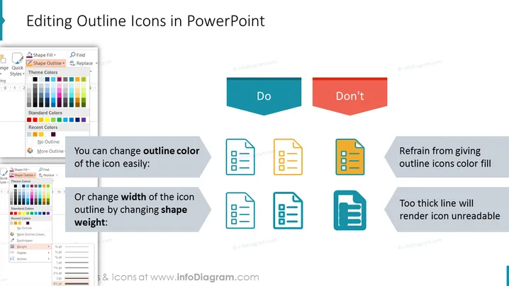
The slide is titled "Editing Outline Icons in PowerPoint" and is likely a tutorial on icon customization within the presentation software. It illustrates the best practices with a "Do" and "Don't" approach. The "Do" side suggests that you can easily change the color of an icon's outline or adjust the icon's outline width by modifying the shape weight. These actions maintain icon clarity. In contrast, the "Don't" side advises against filling outline icons with color and against using excessively thick lines, as these can make icons less readable.
The overall look of the slide is clean and professional, with a clear distinction between recommended and discouraged practices. The use of blue for positive actions and red for negative ones provides an intuitive visual cue for viewers.


