Your graphics add a nice touch to my presentations and I recently used them for one of my all-hands meetings. Your toolbox adds professionalism to my slides. Instead of using standard clipart.
Claude Jones, Director of Engineer, @Walmartlabs, USA
Your graphics add a nice touch to my presentations and I recently used them for one of my all-hands meetings. Your toolbox adds professionalism to my slides. Instead of using standard clipart.
Claude Jones, Director of Engineer, @Walmartlabs, USA
I needed a fresh look at some of my slides. I've tried to find a way to create a paintbrush effect, to underline, accentuate, add some color and the handwritten markers were just the things. Very easy to use, easy to size, change the color. It was an affordable, perfect solution and I'm happy to recommend it.
Anonymous, US
The crisp, clean look of the graphics, and the fact that it allowed me to easily edit and change the colors to match the template was my main reason for purchasing them.
Brandie Jenkins, E-learning Developer, USA
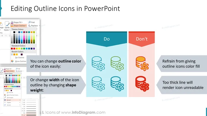
The slide titled "Editing Outline Icons in PowerPoint" compares the best practices for modifying the appearance of icons within PowerPoint presentations. On the left, under the "Do" section, it suggests that one can easily change the outline color of the icon, providing a visual example with icons colored in a blue shade. This section also advises altering the width of the icon outline by changing the shape weight, accompanied by an image showing varied outline thicknesses. Conversely, on the right, under the "Don't" section, it cautions against giving outline icons a color fill and using excessively thick lines, which can make the icon unreadable, as demonstrated by overly bright and thick outline examples.
The slide has a clean, modern design with clear visual distinctions between the recommended and discouraged practices for icon editing. The contrasting colors and simple iconography effectively communicate the do's and don'ts.


