Your graphics add a nice touch to my presentations and I recently used them for one of my all-hands meetings. Your toolbox adds professionalism to my slides. Instead of using standard clipart.
Claude Jones, Director of Engineer, @Walmartlabs, USA
Your graphics add a nice touch to my presentations and I recently used them for one of my all-hands meetings. Your toolbox adds professionalism to my slides. Instead of using standard clipart.
Claude Jones, Director of Engineer, @Walmartlabs, USA
I needed a fresh look at some of my slides. I've tried to find a way to create a paintbrush effect, to underline, accentuate, add some color and the handwritten markers were just the things. Very easy to use, easy to size, change the color. It was an affordable, perfect solution and I'm happy to recommend it.
Anonymous, US
The crisp, clean look of the graphics, and the fact that it allowed me to easily edit and change the colors to match the template was my main reason for purchasing them.
Brandie Jenkins, E-learning Developer, USA
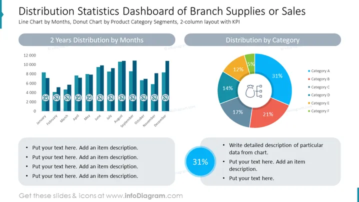
The PowerPoint slide titled "Distribution Statistics Dashboard of Branch Supplies or Sales" presents a visual comparison of statistical data via a bar chart labeled "2 Years Distribution by Months" and a donut chart labeled "Distribution by Category". Each chart is accompanied by a legend detailing categories or metrics. Bullet points beneath both charts offer a place for additional descriptions. This slide is designed to summarize complex data in a visually digestible format, effectively communicating patterns and proportions in data distribution over time and across different product categories.
The slide has a clean, professional appearance with a harmonious balance of graphical and textual information. The use of color is functional, aiding in distinguishing various data segments, and the icons add a layer of visual interest.


