Your graphics add a nice touch to my presentations and I recently used them for one of my all-hands meetings. Your toolbox adds professionalism to my slides. Instead of using standard clipart.
Claude Jones, Director of Engineer, @Walmartlabs, USA
Your graphics add a nice touch to my presentations and I recently used them for one of my all-hands meetings. Your toolbox adds professionalism to my slides. Instead of using standard clipart.
Claude Jones, Director of Engineer, @Walmartlabs, USA
I needed a fresh look at some of my slides. I've tried to find a way to create a paintbrush effect, to underline, accentuate, add some color and the handwritten markers were just the things. Very easy to use, easy to size, change the color. It was an affordable, perfect solution and I'm happy to recommend it.
Anonymous, US
The crisp, clean look of the graphics, and the fact that it allowed me to easily edit and change the colors to match the template was my main reason for purchasing them.
Brandie Jenkins, E-learning Developer, USA
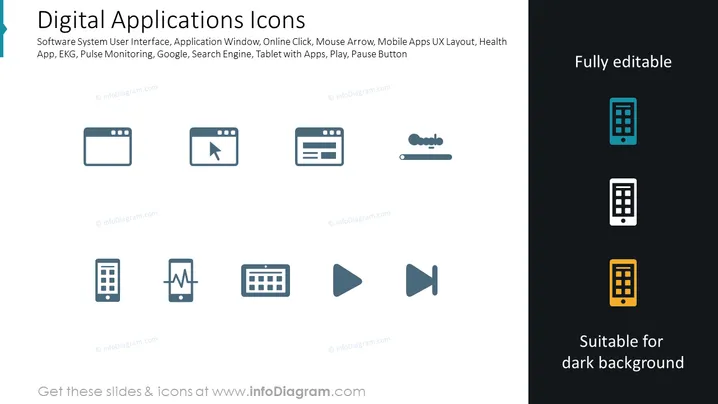
The PowerPoint slide titled "Digital Applications Icons" features a range of icons representing various digital concepts and tools. The icons include depictions of a software system user interface indicating a graphical interface for software systems; an application window implying a user interface container for running applications; an online click, possibly representing e-commerce or web navigation; a mouse arrow, referencing cursor control; mobile apps user experience (UX) layout, which suggests design elements for mobile interfaces; a health app, indicating software related to health tracking or services; EKG, likely relating to heart rate monitoring; a search engine, which is typically used for finding online content; and finally, icons for a tablet with apps, as well as play and pause buttons, suggesting media playback controls.
The overall look of the slide is modern and clean, with iconography that simplifies complex digital concepts into easily understandable visual elements. The use of colors is strategic, drawing attention to certain icons without overwhelming the viewer.


