Your graphics add a nice touch to my presentations and I recently used them for one of my all-hands meetings. Your toolbox adds professionalism to my slides. Instead of using standard clipart.
Claude Jones, Director of Engineer, @Walmartlabs, USA
Your graphics add a nice touch to my presentations and I recently used them for one of my all-hands meetings. Your toolbox adds professionalism to my slides. Instead of using standard clipart.
Claude Jones, Director of Engineer, @Walmartlabs, USA
I needed a fresh look at some of my slides. I've tried to find a way to create a paintbrush effect, to underline, accentuate, add some color and the handwritten markers were just the things. Very easy to use, easy to size, change the color. It was an affordable, perfect solution and I'm happy to recommend it.
Anonymous, US
The crisp, clean look of the graphics, and the fact that it allowed me to easily edit and change the colors to match the template was my main reason for purchasing them.
Brandie Jenkins, E-learning Developer, USA
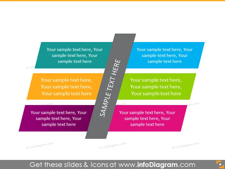
The PowerPoint slide seemingly illustrates a series of steps or options, with each step distinguished by a different color and having placeholder text that suggests customization. The placeholders labeled as "Your sample text here" imply that the slide is meant to be tailored by the presenter to fit the specific content, possibly to show the progression of a process, outline multiple scenarios or options, or to display categorized information for clear communication.
The overall layout is sleek and vibrant, with the use of geometric shapes and contrasting colors to create a sense of movement or progression. This slide evokes a feel of dynamism and has been designed for high visual impact.


