Your graphics add a nice touch to my presentations and I recently used them for one of my all-hands meetings. Your toolbox adds professionalism to my slides. Instead of using standard clipart.
Claude Jones, Director of Engineer, @Walmartlabs, USA
Your graphics add a nice touch to my presentations and I recently used them for one of my all-hands meetings. Your toolbox adds professionalism to my slides. Instead of using standard clipart.
Claude Jones, Director of Engineer, @Walmartlabs, USA
I needed a fresh look at some of my slides. I've tried to find a way to create a paintbrush effect, to underline, accentuate, add some color and the handwritten markers were just the things. Very easy to use, easy to size, change the color. It was an affordable, perfect solution and I'm happy to recommend it.
Anonymous, US
The crisp, clean look of the graphics, and the fact that it allowed me to easily edit and change the colors to match the template was my main reason for purchasing them.
Brandie Jenkins, E-learning Developer, USA
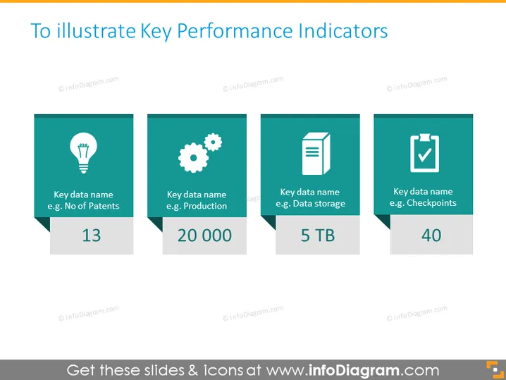
The slide is intended to showcase different Key Performance Indicators (KPIs) with examples like 'Number of Patents', 'Production', 'Data storage', and 'Checkpoints'. Each KPI is represented by a numerical value alongside a suggestive icon. For instance, the 'Number of Patents' KPI is shown with a lightbulb icon and a value of 13, which could represent innovative achievements. 'Production' is indicated by a gear icon with the number 20,000, potentially reflecting output levels. 'Data storage' features a document icon and 5 TB to quantify storage capacity. Finally, 'Checkpoints' is represented with a check mark and the number 40, possibly referring to goals or targets met.
The overall look is modern, minimalistic, and professional, with a color scheme that is easy on the eyes. The use of icons and large numbers makes the data easily digestible at a glance.


