Your graphics add a nice touch to my presentations and I recently used them for one of my all-hands meetings. Your toolbox adds professionalism to my slides. Instead of using standard clipart.
Claude Jones, Director of Engineer, @Walmartlabs, USA
Your graphics add a nice touch to my presentations and I recently used them for one of my all-hands meetings. Your toolbox adds professionalism to my slides. Instead of using standard clipart.
Claude Jones, Director of Engineer, @Walmartlabs, USA
I needed a fresh look at some of my slides. I've tried to find a way to create a paintbrush effect, to underline, accentuate, add some color and the handwritten markers were just the things. Very easy to use, easy to size, change the color. It was an affordable, perfect solution and I'm happy to recommend it.
Anonymous, US
The crisp, clean look of the graphics, and the fact that it allowed me to easily edit and change the colors to match the template was my main reason for purchasing them.
Brandie Jenkins, E-learning Developer, USA
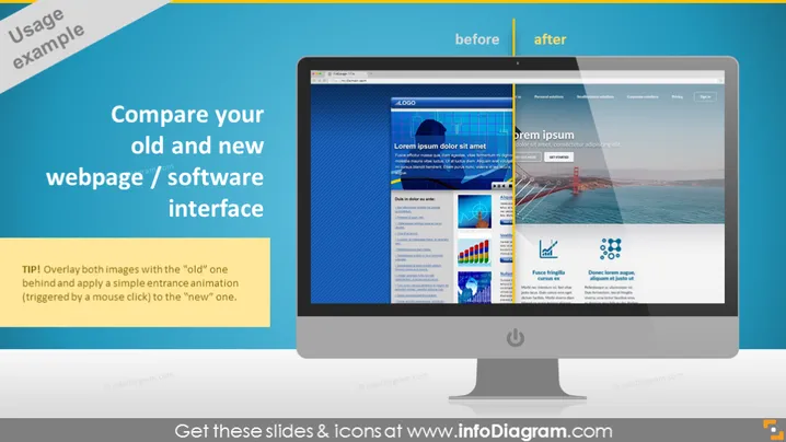
The PowerPoint slide is designed to illustrate a comparison between an old and new webpage or software interface. The slide suggests using an overlay of both images, with the old interface positioned behind the new one, and incorporating a simple entrance animation to transition from the old interface to the new one when triggered by a mouse click. This can visually emphasize the improvements and changes made to the digital asset, and it's a useful way for audiences to appreciate the evolution of a website or software's user interface.
The overall look of the slide is modern and visually engaging, with clear demarcation between the before and after states through the use of contrasting colors and textual labels. The central computer monitor graphic effectively draws the viewer's eyes to the comparison being demonstrated.


