Defects Analysis Metrics
Slide Content
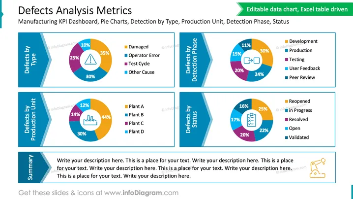
The slide titled 'Defects Analysis Metrics' is geared towards providing a dashboard overview of key performance indicators (KPIs) related to manufacturing defects. It compares defects by type, detection phase, production unit, and status. Each category is represented by a pie chart accompanied by a color-coded legend — 'Defects by type' shows categories such as Damaged, Operator Error, Test Cycle, and Other Cause. 'Defects by detection phase' differentiates between Development, Production, Testing, User Feedback, and Peer Review. 'Defects by production unit' compares different plants labeled A through D. Lastly, 'Defects by status' includes statuses like Reopened, In Progress, Resolved, Open, and Validated. There's also a 'Summary' section below the charts where descriptive text can be added.
Graphical Look
- The title "Defects Analysis Metrics" is prominently displayed in green text at the top of the slide.
- A green banner below the title contains the subtitle "Manufacturing KPI Dashboard, Pie Charts, Detection by Type, Production Unit, Detection Phase, Status" in white text, suggesting the editable nature of the slide's charts.
- Four pie charts are arranged in a 2x2 grid, each with a unique color scheme to distinguish different data categories.
- To the left of each pie chart, labeled rectangular tabs correspond to the colors in the chart, listing categories such as Damaged, Operator Error, Plant A, Development, Reopened.
- A placeholder for a summary with a large text box is located at the lower-left corner, with preset instructional text for the presenter to replace with details.
The slide features a clean and professional design, with a mix of bold colors and soft blue background shades to create a visually appealing contrast. It utilizes a consistent theme with rectangular color tabs next to the pie charts, allowing for quick reference and interpretation.
## Defects Analysis Metrics
Slide Content
The PowerPoint slide titled 'Defects Analysis Metrics' displays a collection of pie charts relating to quality control within a manufacturing setting. The first chart, 'Defects by Type', segments defects into categories: Damaged (35%), Operator Error (30%), Test Cycle (25%), and Other Cause (10%). The second chart, 'Defects by Detection Phase', distinguishes the stages at which defects were identified: Development (30%), Production (24%), Testing (20%), User Feedback (15%), and Peer Review (11%). The third chart, 'Defects by Production Unit,' shows the distribution of defects across different facilities: Plant A (44%), Plant B (30%), Plant C (14%), and Plant D (12%). The fourth chart, 'Defects by Status', tracks the resolution progress of identified defects: In Progress (25%), Resolved (22%), Open (20%), Reopened (17%), and Validated (16%). A summary text box at the bottom invites additional commentary or analysis.
Graphical Look
- The slide has a prominent green headline with white text that reads "Defects Analysis Metrics."
- A green banner is located just below the header, indicating that the charts are editable and driven by an Excel table.
- Four pie charts are presented, each with a corresponding color-coded legend in rectangular tabs that define the chart's components.
- Each pie chart has a bold title on a teardrop-shaped blue background, with a white stripe for contrast, adding an element of design to the titles "Defects by Type," "Defects by Detection Phase," "Defects by Production Unit," and "Defects by Status."
- There is a large text box for a customizable summary at the bottom left, with a series of repetitive placeholder texts.
The overall design is harmonious with a blue and green color scheme, providing a clear representation of data with aest ## Defects Analysis Metrics
Slide Content
The PowerPoint slide 'Defects Analysis Metrics' presents four pie charts, each relating to different aspects of product quality analysis within a manufacturing context. The 'Defects by Type' chart breaks down defects into categories such as Damaged, Operator Error, Test Cycle, and Other Cause, each with a corresponding color and percentage. The 'Defects by Detection Phase' chart categorizes defects found during Development, Production, Testing, User Feedback, and Peer Review. The 'Defects by Production Unit' chart displays the distribution of defects across four different plants, indicated as Plant A, B, C, and D. Lastly, the 'Defects by Status' chart provides insight into the status of defects, whether they are Reopened, In Progress, Resolved, Open, or Validated. Beneath these charts is a summary area for additional explanations or comments.
Graphical Look
- The slide's header is bold and green with the title "Defects Analysis Metrics" in white font.
- Below the title, a green banner suggests that the charts are editable and based on Excel data.
- There are four pie charts displayed in a grid-like pattern, each with a distinct color scheme and corresponding percentage labels.
- The legends for the pie charts are neatly arranged in colorful rectangles with text labels for easy identification.
- Each chart has a heading in a stylized teardrop-shaped blue banner, enhancing the visual structure of the slide.
- At the bottom left, there's a summary box with generic placeholder text, encouraging the presenter to input their custom summary.
The slide has a professional and sleek appearance, with a consistent blue and green color theme that is visually pleasing and easy to interpret. The use of pie charts, color-coding, and clear section headings makes the information accessible and reader-friendly.
Use Cases
- This slide can be used in monthly or quarterly business reviews to communicate the status of product ## Defects Analysis Metrics
Slide Content
The slide 'Defects Analysis Metrics' displays data on manufacturing defects categorized by type, detection phase, production unit, and status. Under 'Defects by Type,' it lists Damaged, Operator Error, Test Cycle, and Other Cause. 'Defects by Detection Phase' includes Development, Production, Testing, User Feedback, and Peer Review. 'Defects by Production Unit' features plants A through D. Lastly, 'Defects by Status' shows Reopened, In Progress, Resolved, Open, and Validated percentages. The Summary space at the bottom provides an area for additional remarks or analysis to accompany the data presented.
Graphical Look
- The header is a large, green, eye-catching rectangle with the white text "Defects Analysis Metrics" at the top of the slide.
- Beneath the header is a subtitle area with a smaller green banner proclaiming the chart's nature as editable and referencing its Excel table foundation.
- Four colorful pie charts visualize different defect data points, each with a legend linking colors to the data categories.
- The pie charts are featured in individual sections divided by blue banner headings with white text that correspond to each data set theme.
- A text box for a summary is situated in the lower left corner of the layout, featuring a prompt for the presenter to add their description.
- Each pie chart has a neat, circular design with various colors representing different segments, adhering to a polished and consistent aesthetic.
The slide possesses a tidy and professional layout, with smartly used space that allows each pie chart to stand out. The color scheme is vibrant yet not overwhelming, facilitating the clear presentation of complex data.
Use Cases
- This slide is suitable for quality control meetings to discuss defect categorization and prioritize improvement actions.
- It can be employed in management presentations to highlight performance metrics linked to manufacturing defects and their status.
- The slide may be used in cross ## Defects Analysis Metrics
Slide Content
The PowerPoint slide titled 'Defects Analysis Metrics' provides a visual representation of key performance indicators related to manufacturing defects using four pie charts. Each chart focuses on a different metric: 'Defects by Type' with categories like Damaged and Operator Error; 'Defects by Detection Phase' including Phases like Production and Testing; 'Defects by Production Unit' differentiating between Plants A to D; and 'Defects by Status' showing statuses such as In Progress or Resolved. There is a Summary section for additional notes below the charts.
Graphical Look
- The slide's main title, "Defects Analysis Metrics," is in a large green rectangle at the top, with white font.
- A subtitle banner in green below the title indicates that the data charts are editable and driven by an Excel table.
- Four pie charts dominate the slide, each with a distinct set of colored segments representing data points, with a legend in rectangular tabs next to them.
- Each pie chart is complemented by a blue banner with a lighter blue stripe and white text indicating the metric it represents.
- The bottom left area contains a large text box for a summary, with default text prompting the addition of a description.
The slide uses a blue and green color palette that gives it a professional, clean look. The design is straightforward, with a strong focus on the data displayed in the pie charts and easy-to-understand legends that correlate different colors to specific data categories or sectors.
Use Cases
- This slide is ideal for quality assurance and control meetings to address and analyze defects in manufacturing processes.
- It can be used in strategic planning sessions to identify areas for process improvement based on defect origins and status.
- The slide can serve as part of a management review presentation that evaluates production efficacy and quality management systems.
- It can be incorporated into investor or stakeholder briefings to communicate company performance in manufacturing quality and defect ## Defects Analysis Metrics
Slide Content
The 'Defects Analysis Metrics' slide provides a visual breakdown of Key Performance Indicators (KPIs) for manufacturing defects using pie charts that categorize defect types, detection phases, production units, and statuses. 'Defects by Type' chart categorizes defects as Damaged, Operator Error, Test Cycle, and Other Cause. 'Defects by Detection Phase' includes Development, Production, Testing, User Feedback, and Peer Review. 'Defects by Production Unit' differentiates defects among Plant A, Plant B, Plant C, and Plant D. Lastly, 'Defects by Status' sorts defects by Reopened, In Progress, Resolved, Open, and Validated statuses. For added detail, a Summary section is provided.
Graphical Look
- The slide features a bold title "Defects Analysis Metrics" in white text set against a green background at the top.
- Below the title is a thin green banner noting the details "Editable data chart, Excel table driven."
- Four separate pie charts are displayed, each with its own set of colorful segments and a corresponding legend in colored rectangles with labels such as Damaged, Development, Plant A, and Reopened.
- Blue angular banners serve as the headings for each chart, with white text denoting the category each chart represents.
- A designated Summary area is positioned in the bottom left corner, containing placeholder text in a large text box.
The overall design of the slide is clean, modern, and data-focused, using a blue and green color scheme to denote different aspects of defect analysis. Pie charts are paired with color-coordinated legends to allow for quick comprehension of the information presented.
Use Cases
- This slide could be effectively used in business presentations for quality assurance and process improvement meetings to discuss defect metrics.
- The information can be presented during company-wide reviews to showcase manufacturing performance and areas for enhancement.
- The slide is well ## Defects Analysis Metrics
Slide Content
The slide entitled "Defects Analysis Metrics" is structured around Key Performance Indicators (KPIs) pertaining to manufacturing defects, segmented into four pie charts. Each chart targets a theme: 'Defects by Type' offers insights into the causes of defects like 'Damaged' or 'Operator Error'; 'Defects by Detection Phase' shows at which stage in the process defects are uncovered, such as 'Development' or 'Testing'; 'Defects by Production Unit' compares the occurrence of defects across various plants, labeled Plant A through D; 'Defects by Status' illustrates the current handling status of defects including 'In Progress,' 'Resolved,' or 'Open.' A 'Summary' field is available for contextual notes or conclusions.
Graphical Look
- A bold, green headline at the top displays the title "Defects Analysis Metrics" in large, white font.
- Below the title, a green ribbon mentions the slide's capability as "Editable data chart, Excel table driven."
- There are four pie charts, each with different color segments representing data, paired with a side legend in matching colors for easy interpretation of categories such as 'Damaged', 'Production', and 'Reopened'.
- Dark blue banners with white text titles signify themes like 'Defects by Type' and 'Defects by Status' for each chart.
- In the bottom-left corner is a summary text box for additional details, containing placeholder text.
- The design is crisp and uncluttered, utilizing a complementary color scheme of blue and green to differentiate data sets and draw focus to the pie charts.
The slide's graphical layout is professional, conveying complex manufacturing defect data through a combination of vibrant, easily distinguishable charts and legends. The blue and green theme offers both visual appeal and functional clarity.
Use Cases
- Presenting during a management meeting for insights into ongoing quality control issues and identifying areas ## Defects Analysis Metrics
Slide Content
The slide titled 'Defects Analysis Metrics' serves as a KPI dashboard for manufacturing, featuring pie charts to depict defects analysis. The charts examine 'Defects by Type' showing common causes like 'Damaged' and 'Operator Error', 'Defects by Detection Phase' pinpointing when defects are caught ranging from 'Development' to 'Peer Review', 'Defects by Production Unit' comparing different plants labeled A to D, and 'Defects by Status' indicating the resolution status of defects from 'In Progress' to 'Validated'. Additionally, a summary section provides space for contextual insight or explanations related to the charts.
Graphical Look
- Title "Defects Analysis Metrics" is displayed in a prominent green rectangle with white typography at the top of the slide.
- Just below the title is a green ribbon labeled as an editable data chart, hinting at the customizable nature of the slide content.
- Four pie charts in alternating blue and purple color schemes are centered on the slide, each representing different categories with respective percentages.
- Rectangular legends adjacent to each pie chart feature corresponding color blocks to identify each category in the charts.
- Decorative blue headers with white factory icons and titles precede each chart, adding an element of thematic consistency.
- A summary box with placeholder text occupies the bottom left corner, inviting additional details to be provided by the presenter.
The graphical design of the slide is sleek and corporate, with sharp, clean lines and a color palette chosen for clarity and visual impact. The charts are neatly presented with consistent stylistic elements, lending the slide a polished and professional look.
Use Cases
- Ideal for a managerial review or board meeting to report on production quality and defect rates.
- Useful in a team meeting for engineers or quality assurance professionals to analyze defect trends and root causes.
- Suited for investor presentations to showcase the company's focus on quality control and continuous improvement.
I'm sorry, but there is no image attached for me to provide a description or analysis. If you would like to share an image, please attach it to your message, and I would be happy to assist you further.