Your graphics add a nice touch to my presentations and I recently used them for one of my all-hands meetings. Your toolbox adds professionalism to my slides. Instead of using standard clipart.
Claude Jones, Director of Engineer, @Walmartlabs, USA
Your graphics add a nice touch to my presentations and I recently used them for one of my all-hands meetings. Your toolbox adds professionalism to my slides. Instead of using standard clipart.
Claude Jones, Director of Engineer, @Walmartlabs, USA
I needed a fresh look at some of my slides. I've tried to find a way to create a paintbrush effect, to underline, accentuate, add some color and the handwritten markers were just the things. Very easy to use, easy to size, change the color. It was an affordable, perfect solution and I'm happy to recommend it.
Anonymous, US
The crisp, clean look of the graphics, and the fact that it allowed me to easily edit and change the colors to match the template was my main reason for purchasing them.
Brandie Jenkins, E-learning Developer, USA
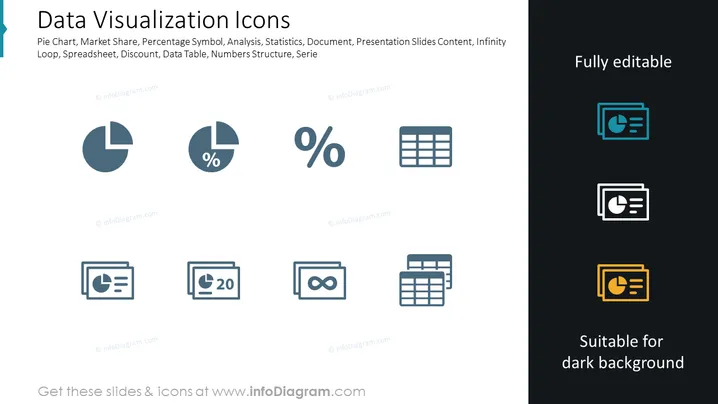
Data Visualization Icons are represented as a collection of symbols linked to charting and statistical analysis. Each icon stands for a different aspect of data visualization, for example, the Pie Chart for showing parts of a whole, the Market Share to depict competitive positioning, the Percentage Symbol for quantitative proportion, Analysis for breaking down complex information, Statistics for summarizing data trends, and so on. These icons serve as visual shorthand for complex concepts, making them comprehensible at a glance.
The slide has a clean, professional appearance with a balanced layout that contrasts the editable icons against both light and dark backgrounds. The icons are stylized and abstract, yet immediately recognizable to anyone familiar with data visualization tools and concepts.


