Your graphics add a nice touch to my presentations and I recently used them for one of my all-hands meetings. Your toolbox adds professionalism to my slides. Instead of using standard clipart.
Claude Jones, Director of Engineer, @Walmartlabs, USA
Your graphics add a nice touch to my presentations and I recently used them for one of my all-hands meetings. Your toolbox adds professionalism to my slides. Instead of using standard clipart.
Claude Jones, Director of Engineer, @Walmartlabs, USA
I needed a fresh look at some of my slides. I've tried to find a way to create a paintbrush effect, to underline, accentuate, add some color and the handwritten markers were just the things. Very easy to use, easy to size, change the color. It was an affordable, perfect solution and I'm happy to recommend it.
Anonymous, US
The crisp, clean look of the graphics, and the fact that it allowed me to easily edit and change the colors to match the template was my main reason for purchasing them.
Brandie Jenkins, E-learning Developer, USA
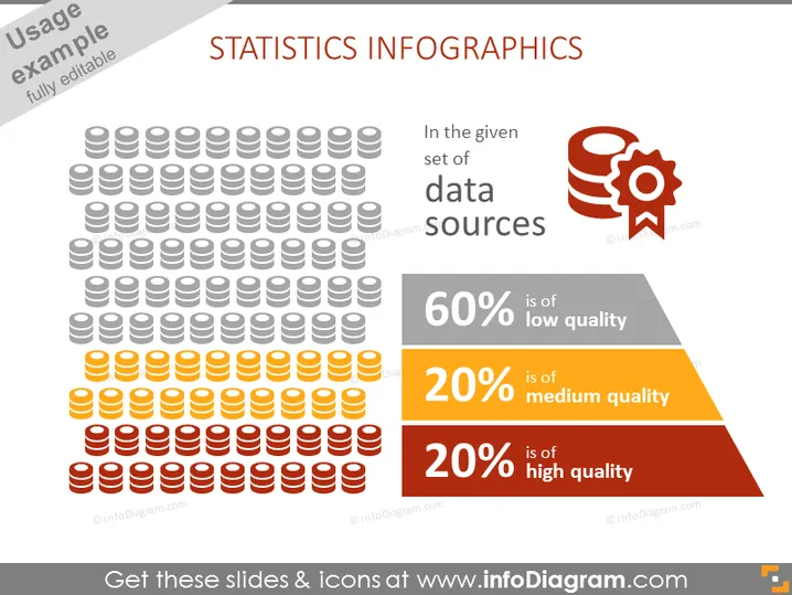
The PowerPoint slide is titled "STATISTICS INFOGRAPHICS" and contains visual representations to depict the quality of data sources. It shows a large group of iconographic figures symbolizing database stacks, with varying colors signifying different levels of data quality: 60% low quality, 20% medium quality, and 20% high quality, offering viewers an instant understanding of the proportions of each data quality category.
The slide employs a color-coding system to easily communicate the concept of data quality. The layout is balanced, with graphics on the left and explanatory text on the right, ensuring a visually appealing and easy-to-follow presentation.


