
Your graphics add a nice touch to my presentations and I recently used them for one of my all-hands meetings. Your toolbox adds professionalism to my slides. Instead of using standard clipart.
Claude Jones, Director of Engineer, @Walmartlabs, USA
Your graphics add a nice touch to my presentations and I recently used them for one of my all-hands meetings. Your toolbox adds professionalism to my slides. Instead of using standard clipart.
Claude Jones, Director of Engineer, @Walmartlabs, USA
I needed a fresh look at some of my slides. I've tried to find a way to create a paintbrush effect, to underline, accentuate, add some color and the handwritten markers were just the things. Very easy to use, easy to size, change the color. It was an affordable, perfect solution and I'm happy to recommend it.
Anonymous, US
The crisp, clean look of the graphics, and the fact that it allowed me to easily edit and change the colors to match the template was my main reason for purchasing them.
Brandie Jenkins, E-learning Developer, USA
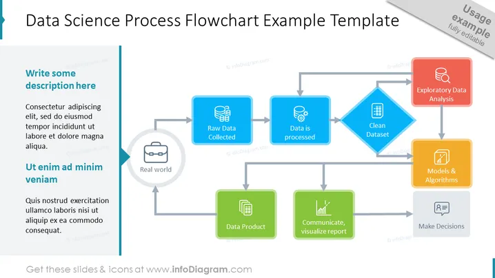
##Slide contents: This PPT Template shows the Data Science Process Flowchart. First, raw data is collected from the real world. Then, the data is processed to produce a clean dataset. After the production of a clean dataset, an exploratory data analysis is done. Using machines and algorithms, a data product is created which is communicated and visualized using a report to make decisions. The data product is used again in the real world. You can use this data science model if you are a marketing specialist, data scientist, or financial analyst who uses data analytics to solve a business problem. You can download this template on Google Slides and Keynote.
##Slide Infographic Description: White Background, Colorful Data Science Flowchart, Text Box, Business Icon, Database Set Icon, Big Data Icon, Data Processing Icon, Clean Data Set Icon, Structured Data Icon, Data Analysis Icon, Data Mining Model Icon, Data Product Icon, Prediction Icon, Message Icon, Comment Icon, Make Decision Icon




