Your graphics add a nice touch to my presentations and I recently used them for one of my all-hands meetings. Your toolbox adds professionalism to my slides. Instead of using standard clipart.
Claude Jones, Director of Engineer, @Walmartlabs, USA
Your graphics add a nice touch to my presentations and I recently used them for one of my all-hands meetings. Your toolbox adds professionalism to my slides. Instead of using standard clipart.
Claude Jones, Director of Engineer, @Walmartlabs, USA
I needed a fresh look at some of my slides. I've tried to find a way to create a paintbrush effect, to underline, accentuate, add some color and the handwritten markers were just the things. Very easy to use, easy to size, change the color. It was an affordable, perfect solution and I'm happy to recommend it.
Anonymous, US
The crisp, clean look of the graphics, and the fact that it allowed me to easily edit and change the colors to match the template was my main reason for purchasing them.
Brandie Jenkins, E-learning Developer, USA
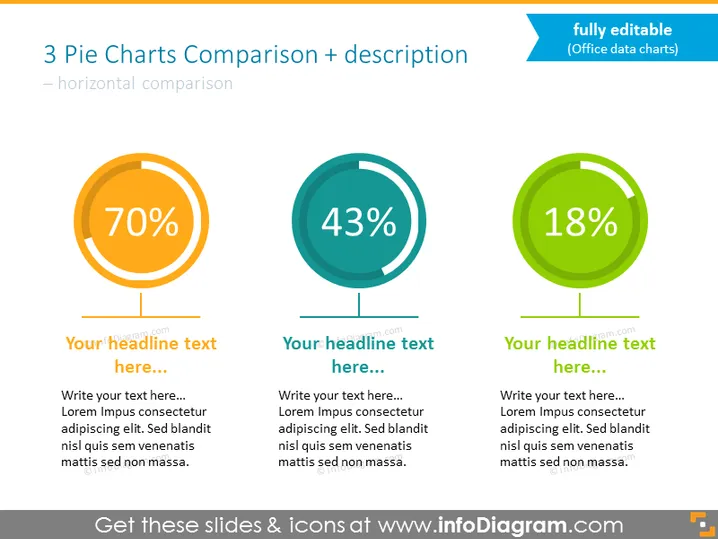
##Data-driven Charts With Percentage and Place for Description Template
Compare 3 percentage metrics using this bold slide with pie charts. Discuss numbers with diagrams presenting results in the form of colorful rings illustrating shares. All charts in this slide are Excle data-driven graphics easy to modify and implement your statistics. Add descriptions and titles, and you are ready to present.
##What Does This Data-driven Charts With Percentage and Place for Description Template Include?
This Data-driven Charts With Percentage and Place for Description Template is a part of our Flat Data-Driven Presentation Charts PPT Template.


