Customers Distribution Chart by FICO Model
Slide Content
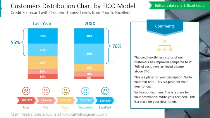
The slide compares customer creditworthiness distribution between last year and the current year using a vertical stacked bar chart, with each segment color-coded by FICO score range. "Last Year" shows a 55% negative change in customer distribution, with the majority scoring in the "Poor" to "Fair" range. Conversely, "20XX" displays a positive 70% shift towards the "Very good" and "Excellent" categories, indicating an improvement in customer credit scores.
- "Poor" (300-579): A severe credit risk with a high likelihood of default.
- "Fair" (580-669): Representing below-average creditworthiness, with an increased risk of default.
- "Good" (670-739): Suggesting average creditworthiness with moderate risk.
- "Very good" (740-799): Reflects above-average credit standing, with lower risk.
- "Excellent" (800-850): The highest creditworthiness level, with the least risk of default.
Graphical Look
- The slide's title is in bold, large font, utilizing two shades of blue, making it the focal point of the slide.
- A multi-colored, vertical stacked bar chart is present, with each color representing a range of FICO scores.
- To the left and right of the bar chart are large, bold percentage marks (55% and 70%) in teal, indicating a numerical change.
- A side comment section with a placeholder text box is included on the right side of the slide.
- A connection diagram with a small flowchart is placed above the comment box.
- At the bottom of the chart, emoticons with different expressions correlate with the FICO score ranges, accompanied by red arrows.
- Text labels for the ranges of credit scores are located just below the chart and are color-matched to the corresponding segment in the bar chart.
The slide features a contemporary design ## Customers Distribution Chart by FICO Model
Slide Content
The slide presents a "Customers Distribution Chart by FICO Model," analyzing changes in creditworthiness from "Last Year" to "20XX." Two stacked bar charts depict the percentage of customers falling within different FICO score ranges: "Poor," "Fair," "Good," "Very Good," and "Excellent." The left bar represents last year with a significant portion in the lower score ranges, while the right bar indicates an improvement in the current year with 70% of customers having scores above 740.
Graphical Look
-
The title is prominently displayed in large, dark blue text, highlighted with a lighter blue color.
-
Two stacked bar charts comparisively represent data for "Last Year" and "20XX," with contrasting colors for each FICO score category.
-
On the left, a large teal-colored callout with "55%" references a decrease, contrasted by a "70%" callout on the right suggesting an increase.
-
A separate text box for comments is located on the right, with a three-tier hierarchy flowchart icon above it.
-
Each FICO score range is assigned a distinct color: red for "Poor," orange for "Fair," light orange for "Good," light blue for "Very Good," and dark blue for "Excellent."
-
Emoticon faces corresponding to the FICO score sentiment are placed at the bottom of the chart, with colors matching the score categories.
-
The different scores are neatly labeled below the emoticons with a clear color-coded system against a subtle gray backdrop.
The slide is visually balanced, with bold colors for chart elements and a clean, professional layout. Icons and emoticons add a layer of visual engagement to the data presentation.
Use Cases
-
Ideal for financial presentations to illustrate changes in customer credit scores over time.
-
Useful for credit and risk assessment meetings to visually communicate the credit profile of a customer base.
-
Can be employed ## Customers Distribution Chart by FICO Model
Slide Content
The slide titled "Customers Distribution Chart by FICO Model" visually compares customer credit score distributions across two periods, marked as "Last Year" and "20XX". The data is categorized by credit score ranges: Poor (300-579), Fair (580-669), Good (670-739), Very Good (740-799), and Excellent (800-850). There's a noted improvement from last year to the current year, with a shift towards a higher percentage of customers having Very Good and Excellent credit scores. A comment box suggests an overall improvement in creditworthiness, noting that 70% of customers now have a score above 740.
Graphical Look
- The title of the slide is displayed at the top in a large, dark blue font set against a white background, with a subheading in smaller font size.
- The central feature is a vertical, color-coded bar chart comparing two time periods, with percentages clearly indicated for each section.
- Next to each bar chart are large, bold percentage figures (55% and 70%) in a distinctive teal font, connected to the bars with curved brackets.
- A separate comment section is placed to the right, with a deep blue banner headline and a placeholder text area below it, featuring a hierarchy chart icon at the top.
- Emoticons representing different sentiments are placed at the bottom of the bar chart corresponding to the color-coded score categories.
- Each score range is identified by colored arrows pointing to the respective segments on the chart; the colors match the segments they're referencing.
The slide has a crisp, professional appearance, with contrasting colors that draw attention to the key elements. It balances the use of bold colors and simple icons to convey complex data in a digestible format.
Use Cases
- Presenting annual credit score analysis in business meetings with stakeholders, board members, or investors.
- Illustrating customer credit health in financial sector presentations, such ## Customers Distribution Chart by FICO Model
Slide Content
This slide depicts a bar graph titled "Customers Distribution Chart by FICO Model," contrasting credit scorecard levels from "Poor" to "Excellent." The graph compares the distribution changes between 'Last Year' and '20XX,' with emphasis on customer creditworthiness improvements. Each FICO score range has a corresponding color and percentage, where 'Poor' indicates high risk, 'Fair' is below average risk, 'Good' signifies average risk, 'Very Good' demonstrates above-average credit quality, and 'Excellent' represents the highest credit quality with the lowest risk.
Graphical Look
- The slide header is split between a larger font blue title and a smaller green subtitle.
- Two vertical stacked bar charts, outlined in blue, show credit score distributions using a gradient of five colors from red to dark blue.
- Large, curved percentage callouts (55% and 70%) emphasize the contrast between the two years displayed.
- On the right side, there is a speech bubble-style comment section in blue with a placeholder text and an organizational chart symbol.
- Emoticons below the chart reflect the emotional tones associated with each credit score range.
- Arrows and text indicating credit score ranges sit at the bottom of the slide, color-coordinated with the chart segments.
- The comment box has a slight three-dimensional effect, creating a pop-out look.
The overall visual theme is clean and corporate, with a clear color-coding system that makes the data easily understandable at a glance. The use of expressive icons adds a user-friendly touch to the otherwise formal financial data.
Use Cases
- To present credit score analysis in a financial institution's internal meeting.
- As part of a quarterly or annual business review with a focus on customer financial health.
- During a risk management presentation to showcase changes in credit risk profile over time.
- In investor briefings to discuss customer base creditworthiness as part of company performance metrics.