Your graphics add a nice touch to my presentations and I recently used them for one of my all-hands meetings. Your toolbox adds professionalism to my slides. Instead of using standard clipart.
Claude Jones, Director of Engineer, @Walmartlabs, USA
Your graphics add a nice touch to my presentations and I recently used them for one of my all-hands meetings. Your toolbox adds professionalism to my slides. Instead of using standard clipart.
Claude Jones, Director of Engineer, @Walmartlabs, USA
I needed a fresh look at some of my slides. I've tried to find a way to create a paintbrush effect, to underline, accentuate, add some color and the handwritten markers were just the things. Very easy to use, easy to size, change the color. It was an affordable, perfect solution and I'm happy to recommend it.
Anonymous, US
The crisp, clean look of the graphics, and the fact that it allowed me to easily edit and change the colors to match the template was my main reason for purchasing them.
Brandie Jenkins, E-learning Developer, USA
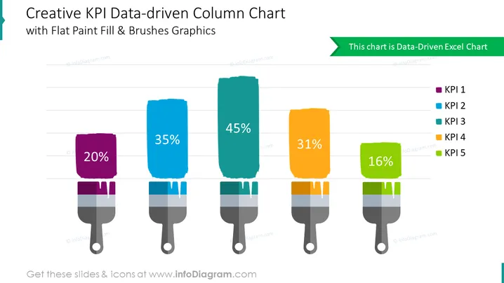
The Creative KPI Data-driven Column Chart Slide can be used when you want to present your company's KPIs visually compellingly and easily understandable. For example, you can use this PPT slide in a performance review presentation to showcase important metrics and highlight areas of success or improvement. You can also use it in product development presentations to showcase performance metrics such as user engagement, product usage, and customer feedback. The chart is divided into different segments, each representing a specific KPI, and color-coded for easy reference. This is a Data-Driven Excel Chart. You can download this PPT template on Google Slides and Keynote.
White Background, Colorful Paint Fill & Brushes Graphics


