Your graphics add a nice touch to my presentations and I recently used them for one of my all-hands meetings. Your toolbox adds professionalism to my slides. Instead of using standard clipart.
Claude Jones, Director of Engineer, @Walmartlabs, USA
Your graphics add a nice touch to my presentations and I recently used them for one of my all-hands meetings. Your toolbox adds professionalism to my slides. Instead of using standard clipart.
Claude Jones, Director of Engineer, @Walmartlabs, USA
I needed a fresh look at some of my slides. I've tried to find a way to create a paintbrush effect, to underline, accentuate, add some color and the handwritten markers were just the things. Very easy to use, easy to size, change the color. It was an affordable, perfect solution and I'm happy to recommend it.
Anonymous, US
The crisp, clean look of the graphics, and the fact that it allowed me to easily edit and change the colors to match the template was my main reason for purchasing them.
Brandie Jenkins, E-learning Developer, USA
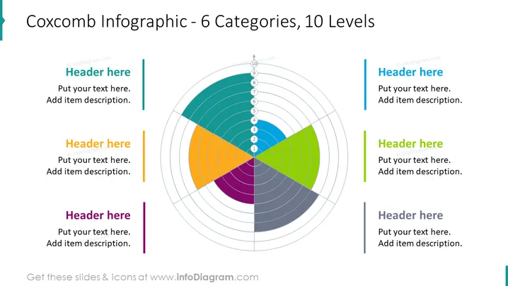
The slide presents a Coxcomb chart, also known as a polar area diagram, which is divided into 6 colored categories, each containing 10 levels to represent data proportionally within a category. Accompanying the chart, there are placeholders for six headers and descriptive texts, presumably to elaborate on each category of the Coxcomb chart. The infographic is ideal for displaying how segments of a whole can vary not only by proportion but also over certain levels or degrees of importance or magnitude.
The slide overall has a modern and clean design, with a balanced use of color and white space to emphasize the visualization. The symmetric arrangement around the central Coxcomb chart creates a harmonious and easy-to-follow layout.


