Your graphics add a nice touch to my presentations and I recently used them for one of my all-hands meetings. Your toolbox adds professionalism to my slides. Instead of using standard clipart.
Claude Jones, Director of Engineer, @Walmartlabs, USA
Your graphics add a nice touch to my presentations and I recently used them for one of my all-hands meetings. Your toolbox adds professionalism to my slides. Instead of using standard clipart.
Claude Jones, Director of Engineer, @Walmartlabs, USA
I needed a fresh look at some of my slides. I've tried to find a way to create a paintbrush effect, to underline, accentuate, add some color and the handwritten markers were just the things. Very easy to use, easy to size, change the color. It was an affordable, perfect solution and I'm happy to recommend it.
Anonymous, US
The crisp, clean look of the graphics, and the fact that it allowed me to easily edit and change the colors to match the template was my main reason for purchasing them.
Brandie Jenkins, E-learning Developer, USA
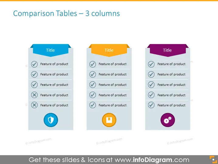
The slide presents a comparison of features across three different products or categories. Each column has a distinctive title at the top, with a list of product features below, and icons indicating whether the feature is present (checkmark) or absent (cross). The use of checkmarks and crosses indicates a straightforward comparison of which features each product possesses, helping viewers quickly discern differences and similarities.
The slide is clean, with a minimalist design that emphasizes simplicity and ease of comparison through the use of color-coding and universal symbols. The tabs and icons serve as a quick reference for viewers to navigate the information being compared.


