Your graphics add a nice touch to my presentations and I recently used them for one of my all-hands meetings. Your toolbox adds professionalism to my slides. Instead of using standard clipart.
Claude Jones, Director of Engineer, @Walmartlabs, USA
Your graphics add a nice touch to my presentations and I recently used them for one of my all-hands meetings. Your toolbox adds professionalism to my slides. Instead of using standard clipart.
Claude Jones, Director of Engineer, @Walmartlabs, USA
I needed a fresh look at some of my slides. I've tried to find a way to create a paintbrush effect, to underline, accentuate, add some color and the handwritten markers were just the things. Very easy to use, easy to size, change the color. It was an affordable, perfect solution and I'm happy to recommend it.
Anonymous, US
The crisp, clean look of the graphics, and the fact that it allowed me to easily edit and change the colors to match the template was my main reason for purchasing them.
Brandie Jenkins, E-learning Developer, USA
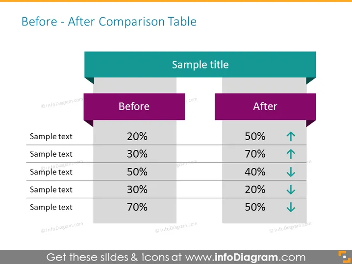
The slide presents a "Before - After Comparison Table" that features two columns labeled "Before" and "After," each consisting of five pairs of items with corresponding percentages. These pairs indicate a comparative metric, with the "Before" column showing the initial state and the "After" column showing the changed state. Each "After" item also includes an arrow, signifying whether the number has increased (up arrow) or decreased (down arrow). This visual comparison indicates performance improvements or declines between two different states.
The slide features a clean and straightforward design with contrasting colors to differentiate between the 'Before' and 'After' states. The use of arrows provides a quick visual cue on the direction of change for each comparative metric.


