Your graphics add a nice touch to my presentations and I recently used them for one of my all-hands meetings. Your toolbox adds professionalism to my slides. Instead of using standard clipart.
Claude Jones, Director of Engineer, @Walmartlabs, USA
Your graphics add a nice touch to my presentations and I recently used them for one of my all-hands meetings. Your toolbox adds professionalism to my slides. Instead of using standard clipart.
Claude Jones, Director of Engineer, @Walmartlabs, USA
I needed a fresh look at some of my slides. I've tried to find a way to create a paintbrush effect, to underline, accentuate, add some color and the handwritten markers were just the things. Very easy to use, easy to size, change the color. It was an affordable, perfect solution and I'm happy to recommend it.
Anonymous, US
The crisp, clean look of the graphics, and the fact that it allowed me to easily edit and change the colors to match the template was my main reason for purchasing them.
Brandie Jenkins, E-learning Developer, USA
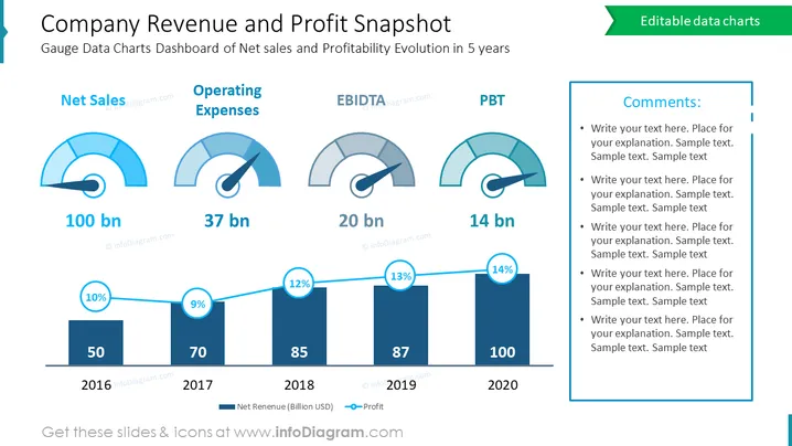
The slide is a financial dashboard that gives a snapshot of a company's revenue and profit performance over five years. It includes gauges for Net Sales, Operating Expenses (OPEX), EBITDA, and Profit Before Tax (PBT), with accompanying figures in billions. There's also a bar graph showing the Net Revenue and Profit percentage, depicting growth over time from 2016 to 2020. This visual summary is designed to provide a clear and concise overview of the company's financial health and trajectory.
Overall, the slide uses a blue and white color scheme to create a clean and professional financial presentation. The combination of gauges and a bar chart provides a quick, at-a-glance understanding of the company's financial status.
This slide would be suitable for use in:


