Your graphics add a nice touch to my presentations and I recently used them for one of my all-hands meetings. Your toolbox adds professionalism to my slides. Instead of using standard clipart.
Claude Jones, Director of Engineer, @Walmartlabs, USA
Your graphics add a nice touch to my presentations and I recently used them for one of my all-hands meetings. Your toolbox adds professionalism to my slides. Instead of using standard clipart.
Claude Jones, Director of Engineer, @Walmartlabs, USA
I needed a fresh look at some of my slides. I've tried to find a way to create a paintbrush effect, to underline, accentuate, add some color and the handwritten markers were just the things. Very easy to use, easy to size, change the color. It was an affordable, perfect solution and I'm happy to recommend it.
Anonymous, US
The crisp, clean look of the graphics, and the fact that it allowed me to easily edit and change the colors to match the template was my main reason for purchasing them.
Brandie Jenkins, E-learning Developer, USA
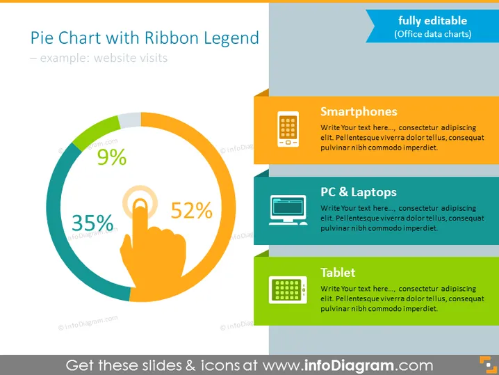
The slide displays a pie chart illustrating statistics for website visits, represented by three devices: Smartphones (52%), PC & Laptops (35%), and Tablet (9%). Each category is color-coded and accompanied by an icon that visualizes the type of device it denotes. The "Smartphones" segment indicates the most significant portion of website visits, suggesting the prevalence of mobile browsing. The "PC & Laptops" section represents a substantial but smaller part of the visits, while "Tablet" shows the least portion, indicating it's the least used device for accessing the website in this example.
The slide has a clean, modern look with bright contrasting colors that make the information stand out. The visual elements are well-organized, allowing for an easy understanding of the data presented.


