Your graphics add a nice touch to my presentations and I recently used them for one of my all-hands meetings. Your toolbox adds professionalism to my slides. Instead of using standard clipart.
Claude Jones, Director of Engineer, @Walmartlabs, USA
Your graphics add a nice touch to my presentations and I recently used them for one of my all-hands meetings. Your toolbox adds professionalism to my slides. Instead of using standard clipart.
Claude Jones, Director of Engineer, @Walmartlabs, USA
I needed a fresh look at some of my slides. I've tried to find a way to create a paintbrush effect, to underline, accentuate, add some color and the handwritten markers were just the things. Very easy to use, easy to size, change the color. It was an affordable, perfect solution and I'm happy to recommend it.
Anonymous, US
The crisp, clean look of the graphics, and the fact that it allowed me to easily edit and change the colors to match the template was my main reason for purchasing them.
Brandie Jenkins, E-learning Developer, USA
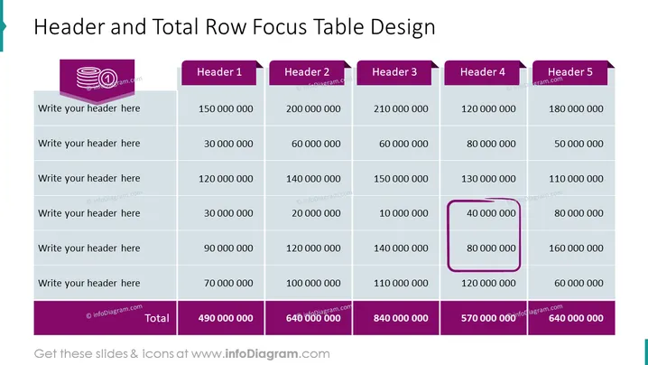
The PowerPoint slide titled "Header and Total Row Focus Table Design" contains a table designed to highlight key information. The table includes six rows labeled "Write your header here" for custom headers, with numbers representing data points under headers titled "Header 1" to "Header 5." There is also a "Total" row at the bottom, summing the columns. An emphasized cell with a bold border under "Header 3" seems to draw attention to a specific data point.
The overall design is very structured and geared towards presenting data in a clear, organized manner. The color contrast and focus on the selected cell make the important information stand out.


