Your graphics add a nice touch to my presentations and I recently used them for one of my all-hands meetings. Your toolbox adds professionalism to my slides. Instead of using standard clipart.
Claude Jones, Director of Engineer, @Walmartlabs, USA
Your graphics add a nice touch to my presentations and I recently used them for one of my all-hands meetings. Your toolbox adds professionalism to my slides. Instead of using standard clipart.
Claude Jones, Director of Engineer, @Walmartlabs, USA
I needed a fresh look at some of my slides. I've tried to find a way to create a paintbrush effect, to underline, accentuate, add some color and the handwritten markers were just the things. Very easy to use, easy to size, change the color. It was an affordable, perfect solution and I'm happy to recommend it.
Anonymous, US
The crisp, clean look of the graphics, and the fact that it allowed me to easily edit and change the colors to match the template was my main reason for purchasing them.
Brandie Jenkins, E-learning Developer, USA
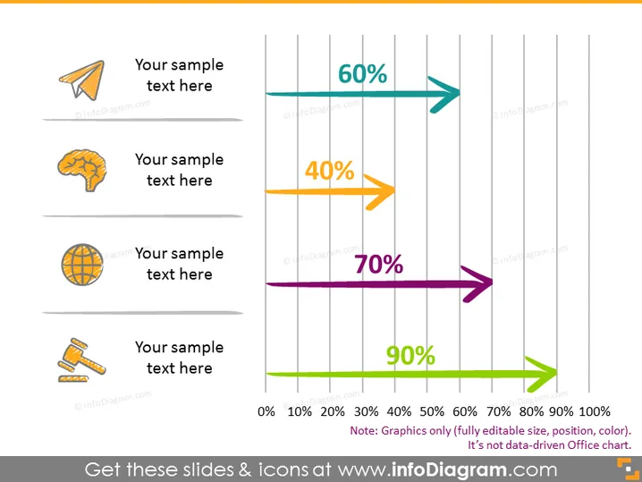
The slide displays a visual representation of percentage values through colorful horizontal arrows, each with a different length correlating to its respective percentage value indicated on the arrow itself. There are four distinct items, each with an icon and a placeholder text "Your sample text here," suggesting the option to customize the description for each percentage value. The presented percentages are 60%, 40%, 70%, and 90%, showcasing a variability that could correspond to outcomes, completion levels, or other metrics requiring a visual percentage scale.
The slide's design is clear and modern, using bold colors and simple icons to convey information quickly and effectively. The arrows serve both as graphical elements and as visual indicators of performance or status.


