Your graphics add a nice touch to my presentations and I recently used them for one of my all-hands meetings. Your toolbox adds professionalism to my slides. Instead of using standard clipart.
Claude Jones, Director of Engineer, @Walmartlabs, USA
Your graphics add a nice touch to my presentations and I recently used them for one of my all-hands meetings. Your toolbox adds professionalism to my slides. Instead of using standard clipart.
Claude Jones, Director of Engineer, @Walmartlabs, USA
I needed a fresh look at some of my slides. I've tried to find a way to create a paintbrush effect, to underline, accentuate, add some color and the handwritten markers were just the things. Very easy to use, easy to size, change the color. It was an affordable, perfect solution and I'm happy to recommend it.
Anonymous, US
The crisp, clean look of the graphics, and the fact that it allowed me to easily edit and change the colors to match the template was my main reason for purchasing them.
Brandie Jenkins, E-learning Developer, USA
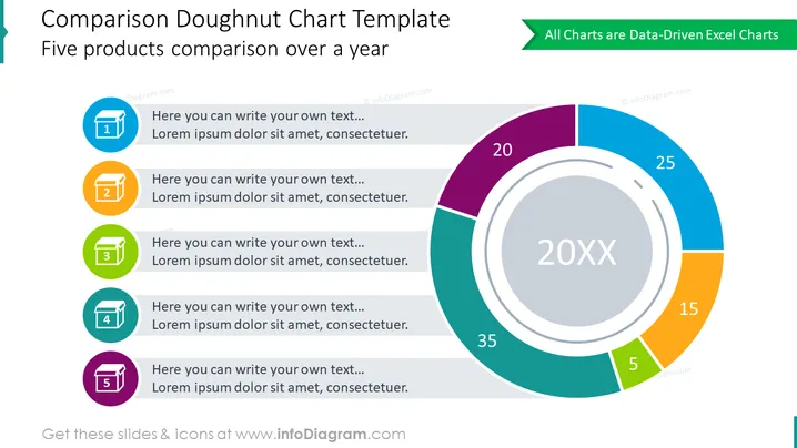
The slide presents a comparative analysis tool titled "Comparison Doughnut Chart Template," focusing on the comparison of five products over a year. The chart shows percentage distributions for each product, indicating their proportion of a whole. Accompanying the chart are five numbered colored sections which likely represent data points or categories for each product. Each section includes a placeholder text suggesting where additional information could be filled in.
The slide is professionally designed, with a modern and functional aesthetic that balances visual interest and information clarity. The color choices are appealing and help to differentiate the data points.


