Your graphics add a nice touch to my presentations and I recently used them for one of my all-hands meetings. Your toolbox adds professionalism to my slides. Instead of using standard clipart.
Claude Jones, Director of Engineer, @Walmartlabs, USA
Your graphics add a nice touch to my presentations and I recently used them for one of my all-hands meetings. Your toolbox adds professionalism to my slides. Instead of using standard clipart.
Claude Jones, Director of Engineer, @Walmartlabs, USA
I needed a fresh look at some of my slides. I've tried to find a way to create a paintbrush effect, to underline, accentuate, add some color and the handwritten markers were just the things. Very easy to use, easy to size, change the color. It was an affordable, perfect solution and I'm happy to recommend it.
Anonymous, US
The crisp, clean look of the graphics, and the fact that it allowed me to easily edit and change the colors to match the template was my main reason for purchasing them.
Brandie Jenkins, E-learning Developer, USA
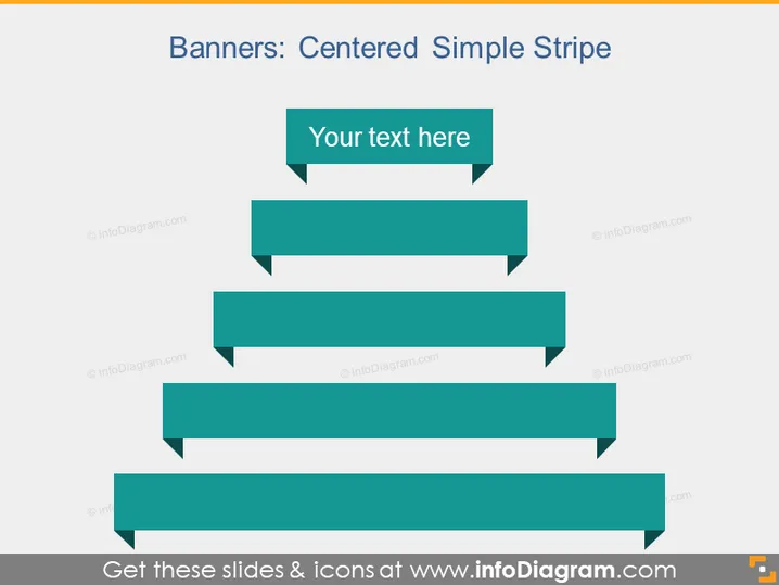
The slide presents a hierarchical concept of "Banners: Centered Simple Stripe" with a series of banners decreasing in size. The top banner, which is the largest, contains placeholder text "Your text here." This arrangement could represent a flow of information, a series of steps, or a breakdown of a central concept into sub-concepts with the largest banner at the top representing the main idea and the others below it depicting subordinate elements.
The slide utilizes a clean and modern design with a simple color palette, focusing attention on the structured layout of the banners. The descending sizes of the rectangles create a visual hierarchy, guiding the viewer's eye from the top to the bottom of the slide.


