Your graphics add a nice touch to my presentations and I recently used them for one of my all-hands meetings. Your toolbox adds professionalism to my slides. Instead of using standard clipart.
Claude Jones, Director of Engineer, @Walmartlabs, USA
Your graphics add a nice touch to my presentations and I recently used them for one of my all-hands meetings. Your toolbox adds professionalism to my slides. Instead of using standard clipart.
Claude Jones, Director of Engineer, @Walmartlabs, USA
I needed a fresh look at some of my slides. I've tried to find a way to create a paintbrush effect, to underline, accentuate, add some color and the handwritten markers were just the things. Very easy to use, easy to size, change the color. It was an affordable, perfect solution and I'm happy to recommend it.
Anonymous, US
The crisp, clean look of the graphics, and the fact that it allowed me to easily edit and change the colors to match the template was my main reason for purchasing them.
Brandie Jenkins, E-learning Developer, USA
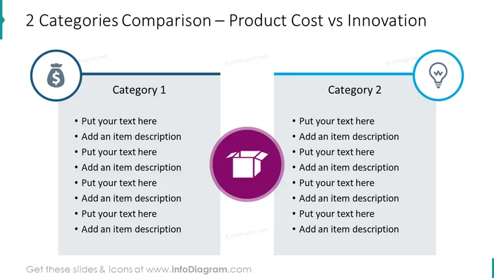
The slide presents a comparison between two categories: Product Cost (Category 1) and Innovation (Category 2). Each category has space for text entries and descriptions underneath, suggesting that the slide is meant for elaborating on different aspects or examples of Product Cost and Innovation. There's an emphasis on contrasting these two elements, typically essential in business strategy and product development, highlighting how costs and innovative features can be balanced or compared.
The slide has a clean and professional appearance, with a clear distinction between the two categories through the use of color and icons. Visual elements are kept minimalistic to focus the viewer's attention on the content.


