Your graphics add a nice touch to my presentations and I recently used them for one of my all-hands meetings. Your toolbox adds professionalism to my slides. Instead of using standard clipart.
Claude Jones, Director of Engineer, @Walmartlabs, USA
Your graphics add a nice touch to my presentations and I recently used them for one of my all-hands meetings. Your toolbox adds professionalism to my slides. Instead of using standard clipart.
Claude Jones, Director of Engineer, @Walmartlabs, USA
I needed a fresh look at some of my slides. I've tried to find a way to create a paintbrush effect, to underline, accentuate, add some color and the handwritten markers were just the things. Very easy to use, easy to size, change the color. It was an affordable, perfect solution and I'm happy to recommend it.
Anonymous, US
The crisp, clean look of the graphics, and the fact that it allowed me to easily edit and change the colors to match the template was my main reason for purchasing them.
Brandie Jenkins, E-learning Developer, USA
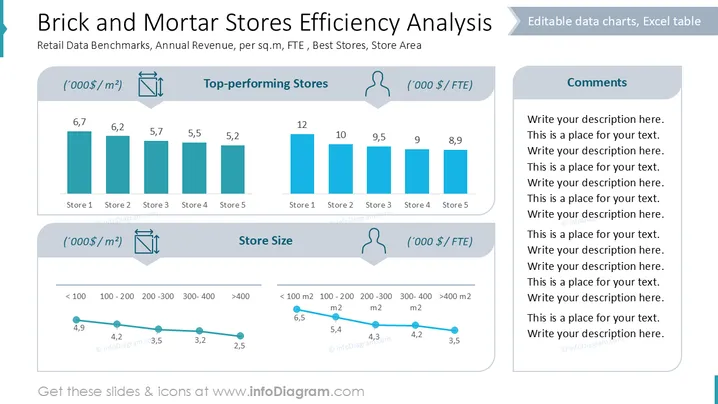
The slide analyzes retail benchmarks, focusing on annual revenue per square meter and per full-time equivalent (FTE) in "Top-performing Stores" and "Store Size" categories. Store 1 is the best performer in both revenue indicators, whereas Store 5 shows the lowest performance. The store size is analyzed across different area categories, with efficiency decreasing as store size increases, both by revenue per square meter and per FTE.
Title and Headers: The slide uses bold and prominent typography for the title and section headers, which are set against a white background for clear readability.
Bar Charts: Two sets of vertical bar charts display data for five stores under the "Top-performing Stores" section. They are colored in a consistent blue, which aids in comprehending differences.
Line Graphs: Two line graphs depict changes in store efficiency across different size categories. The lines are blue with circular markers to highlight data points.
Icons: Small icons representing measurement units and a person are used to indicate data types, adding visual interest and clarity.
Comments Section: On the right, there's reserved space for text comments, bordered by a light gray background.
The overall layout is clean and organized, utilizing distinct sections to separate data. The use of blue and gray creates a professional aesthetic, aligning with the content being presented.


