Your graphics add a nice touch to my presentations and I recently used them for one of my all-hands meetings. Your toolbox adds professionalism to my slides. Instead of using standard clipart.
Claude Jones, Director of Engineer, @Walmartlabs, USA
Your graphics add a nice touch to my presentations and I recently used them for one of my all-hands meetings. Your toolbox adds professionalism to my slides. Instead of using standard clipart.
Claude Jones, Director of Engineer, @Walmartlabs, USA
I needed a fresh look at some of my slides. I've tried to find a way to create a paintbrush effect, to underline, accentuate, add some color and the handwritten markers were just the things. Very easy to use, easy to size, change the color. It was an affordable, perfect solution and I'm happy to recommend it.
Anonymous, US
The crisp, clean look of the graphics, and the fact that it allowed me to easily edit and change the colors to match the template was my main reason for purchasing them.
Brandie Jenkins, E-learning Developer, USA
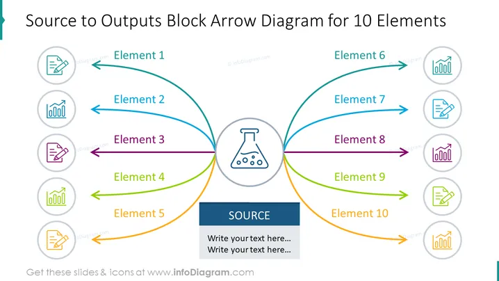
The slide is designed to illustrate a central 'Source' from which ten elements are derived, indicating a process flow or input-output relationship. Elements 1 through 5 are shown radiating from the left side of the source, while elements 6 through 10 spread out to the right. Each element is denoted by a curved arrow leading to an icon in a circle, signifying different outputs or components emerging from the central source. The slide conveys a structure that can be useful for illustrating complex systems, processes, or organizational structures where various elements are interconnected to a common central core.
The slide has a symmetrical design with the centralized source flask icon, vibrant color-coded arrows, and icons harmoniously balancing each side. It's visually pleasing with a professional and clean layout ideal for business presentations.


