Your graphics add a nice touch to my presentations and I recently used them for one of my all-hands meetings. Your toolbox adds professionalism to my slides. Instead of using standard clipart.
Claude Jones, Director of Engineer, @Walmartlabs, USA
Your graphics add a nice touch to my presentations and I recently used them for one of my all-hands meetings. Your toolbox adds professionalism to my slides. Instead of using standard clipart.
Claude Jones, Director of Engineer, @Walmartlabs, USA
I needed a fresh look at some of my slides. I've tried to find a way to create a paintbrush effect, to underline, accentuate, add some color and the handwritten markers were just the things. Very easy to use, easy to size, change the color. It was an affordable, perfect solution and I'm happy to recommend it.
Anonymous, US
The crisp, clean look of the graphics, and the fact that it allowed me to easily edit and change the colors to match the template was my main reason for purchasing them.
Brandie Jenkins, E-learning Developer, USA
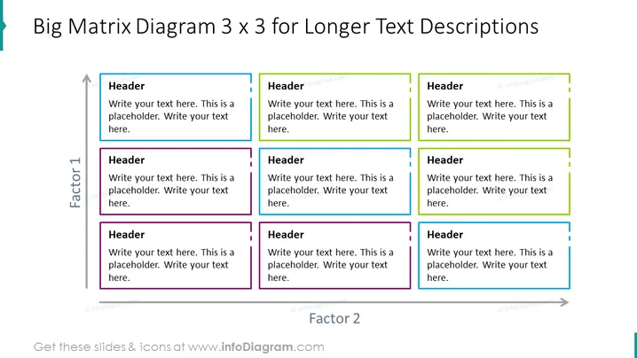
The slide is designed to showcase a matrix structure, allowing the presentation of data or concepts in nine cells, each with a unique header, arranged in a 3x3 grid. This format facilitates the comparison and contrast of three elements across three factors. Each cell contains a placeholder text signaling where the presenter can input specific information. The headers suggest a structured approach for delivering comprehensive content, with each cell intended to elaborate on a particular aspect or idea related to the overall theme.
The slide has a clean, professional appearance with a straightforward layout that emphasizes clarity and organization. The color-coding of the columns provides a visual segmentation that aids in quickly distinguishing the categories or groups represented.


