Your graphics add a nice touch to my presentations and I recently used them for one of my all-hands meetings. Your toolbox adds professionalism to my slides. Instead of using standard clipart.
Claude Jones, Director of Engineer, @Walmartlabs, USA
Your graphics add a nice touch to my presentations and I recently used them for one of my all-hands meetings. Your toolbox adds professionalism to my slides. Instead of using standard clipart.
Claude Jones, Director of Engineer, @Walmartlabs, USA
I needed a fresh look at some of my slides. I've tried to find a way to create a paintbrush effect, to underline, accentuate, add some color and the handwritten markers were just the things. Very easy to use, easy to size, change the color. It was an affordable, perfect solution and I'm happy to recommend it.
Anonymous, US
The crisp, clean look of the graphics, and the fact that it allowed me to easily edit and change the colors to match the template was my main reason for purchasing them.
Brandie Jenkins, E-learning Developer, USA
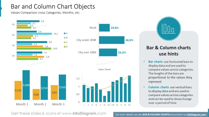
The slide titled "Bar and Column Chart Objects" covers how to use bar and column charts for comparing values across categories, months, and other variables. It contains examples of both chart types: bar charts are shown with horizontal bars representing different categories such as "City under 200K" with percentages, while column charts use vertical bars, seen below depicting monetary values over three months and displaying a sales trend over twelve months, using vertical bars with a dotted line connecting the top points to indicate trend.
The visual composition is composed of clean lines, well-organized graphics, and a color-coded system for easy interpretation. It effectively combines text and graphical elements to illustrate data comparison techniques using bar and column charts.


