Your graphics add a nice touch to my presentations and I recently used them for one of my all-hands meetings. Your toolbox adds professionalism to my slides. Instead of using standard clipart.
Claude Jones, Director of Engineer, @Walmartlabs, USA
Your graphics add a nice touch to my presentations and I recently used them for one of my all-hands meetings. Your toolbox adds professionalism to my slides. Instead of using standard clipart.
Claude Jones, Director of Engineer, @Walmartlabs, USA
I needed a fresh look at some of my slides. I've tried to find a way to create a paintbrush effect, to underline, accentuate, add some color and the handwritten markers were just the things. Very easy to use, easy to size, change the color. It was an affordable, perfect solution and I'm happy to recommend it.
Anonymous, US
The crisp, clean look of the graphics, and the fact that it allowed me to easily edit and change the colors to match the template was my main reason for purchasing them.
Brandie Jenkins, E-learning Developer, USA
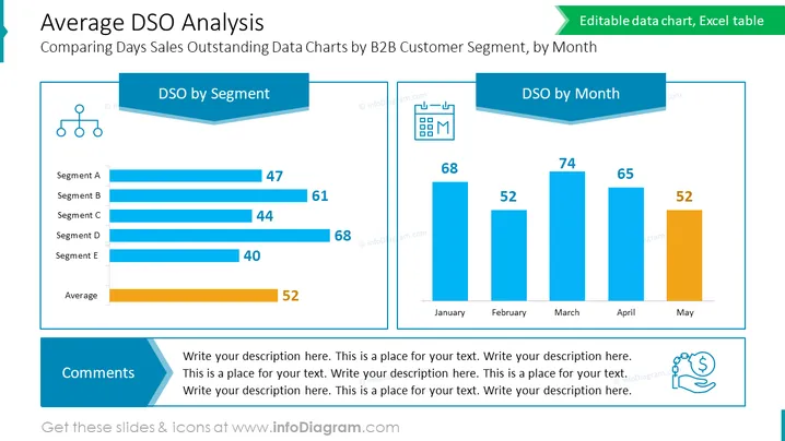
The slide presents data on "Days Sales Outstanding" (DSO) analyzed in two aspects: by business-to-business (B2B) customer segment and by month. On the left, individual segments are labeled from A to E, with their corresponding DSO values, accompanied by an average DSO value across all segments. On the right, the monthly DSO values from January to May are displayed, with changes indicating fluctuations over time. Both analyses are essential for assessing the efficiency of a company's credit and collections processes.
The slide uses a clean and professional design, with a blue and orange color scheme and clear division of content. The use of horizontal and vertical bar charts makes it easy to compare DSO values visually.
The slide titled "Average DSO Analysis" illustrates the "Days Sales Outstanding" (DSO) across different B2B customer segments and months. The left portion of the slide highlights DSO by Segment, with values for five distinct segments (A to E) and the average DSO shown as horizontal bars, conveying how each segment compares against one another and against the average. On the right, DSO by Month is depicted with vertical bars for each month from January to May, showcasing the temporal evolution or consistency in DSO. This side-by-side comparison of segments and months provides a clear overview of the accounts receivable performance in a given timeframe.
The design of the slide is polished and business-like, with a blue and teal color palette that lends an air of professionalism. The charts are paired with icons, and the difference in bar chart orientation (horizontal vs. vertical) provides a visually engaging comparison of the data.
The slide is focused on the "Average DSO Analysis" where DSO stands for Days Sales Outstanding, an important metric in financial analysis indicating how long it takes a company to collect payments after a sale. The slide is divided into two parts: on the left, a horizontal bar chart "DSO by Segment" compares DSO values across different customer segments, indicating A has 47 days, B has 61 days, C has 44 days, D has 68 days, E has 40 days, with an overall average of 52 days. On the right, a vertical bar chart titled "DSO by Month" shows DSO values over a five-month period, specifying January (68 days), February (52 days), March (74 days), April (65 days), and May (52 days), with variations implying shifts in payment collection times.
The overall design is professional with a neat layout, the use of blue and orange provides a clear visual differentiation of data points, and ## Average DSO Analysis
The "Average DSO Analysis" slide compares Days Sales Outstanding data across different B2B customer segments and by month, to characterize receivables efficiency. The "DSO by Segment" section reveals varying DSO values for segments A through E, plus an average DSO value, showcased as horizontal bars. "DSO by Month" displays vertical bars for each month from January to May, depicting DSO trends over time. This information is crucial for financial management, highlighting receivables performance and potential cash flow issues within specific customer segments or time frames.
The slide design is modern and corporate, using a color palette of blue, teal, and orange. The content is organized in a balanced and straightforward manner, allowing for easy comprehension and comparison of data across segments and time.
The slide titled "Average DSO Analysis" showcases a comparison of Days Sales Outstanding (DSO) data across B2B customer segments and by month. The left side provides a horizontal bar chart detailing DSO by Segment, with varying figures: Segment A with 47 days, Segment B with 61, Segment C with 44, Segment D with 68, Segment E with 40, and the average DSO at 52 days. The right side depicts DSO by Month in a vertical bar chart, reflecting values from January to May: 68, 52, 74, 65, and 52 days respectively. These data visualizations are instrumental for evaluating the efficiency of a company's accounts receivable and the speed of collecting payments from clients.
The slide has a professional aesthetic with a clear delineation of information and a coherent color scheme that highlights key data points for quick comprehension. The overall layout facilitates an immediate understanding of the financial concepts presented.
The slide presents an "Average DSO Analysis," providing a comparative view of the Days Sales Outstanding (DSO) metric for B2B customer segments and by month. The left side charts DSO values across five customer segments (Segment A to E) with an additional bar depicting the overall average DSO. Notably, Segment D has the highest DSO at 68 days, whereas Segment E has the lowest at 40 days. On the right, a monthly breakdown from January to May shows fluctuations in DSO, with March peaking at 74 days. This information is crucial for assessing a company's efficiency in collecting receivables and managing cash flow.
The slide exudes a sleek and uncomplicated design utilizing sharp graphics and harmonized colors to allow for effortless data visualization and interpretation. The subtle shadow effect adds depth to the charts and the comment box.
The slide, titled "Average DSO Analysis," displays a comparative analysis of Days Sales Outstanding (DSO) by B2B customer segment and month. Horizontal bars indicate DSO for segments A through E, showing variation between segments, and an orange bar represents the overall average, drawing attention to the collective trend. On the adjacent side, each month from January to May is represented by a vertical bar, charting the evolution or consistency of DSO across the timeframe. The slide is valuable for businesses to evaluate the efficiency of their credit and collections process and understand the liquidity aspect with respect to time and customer segments.
The slide is designed in a professional manner, employing a cohesive blue and orange color scheme which directs attention efficiently to key data points. The layout is spacious, clean, and well-organized, allowing for a clear visual representation of complex financial data ## Average DSO Analysis
The slide is entitled "Average DSO Analysis" and provides insight into the Days Sales Outstanding (DSO) across different segments and months, highlighting how quickly a company collects payments from its customers. On the left, DSO by Segment is illustrated with horizontal bars for each segment (A-E), alongside the average DSO represented by orange. To the right, DSO by Month features vertical bars from January to May, also highlighting the average in orange. This dual-perspective view allows for a comprehensive analysis of transactional efficiency by customer segment and time period, which is crucial for financial forecasting and decision-making.
The slide possesses a clean and corporate aesthetic with a clear visual hierarchy, employing contrasting colors for emphasis and iconography for a quick understanding of the data provided.


