Your graphics add a nice touch to my presentations and I recently used them for one of my all-hands meetings. Your toolbox adds professionalism to my slides. Instead of using standard clipart.
Claude Jones, Director of Engineer, @Walmartlabs, USA
Your graphics add a nice touch to my presentations and I recently used them for one of my all-hands meetings. Your toolbox adds professionalism to my slides. Instead of using standard clipart.
Claude Jones, Director of Engineer, @Walmartlabs, USA
I needed a fresh look at some of my slides. I've tried to find a way to create a paintbrush effect, to underline, accentuate, add some color and the handwritten markers were just the things. Very easy to use, easy to size, change the color. It was an affordable, perfect solution and I'm happy to recommend it.
Anonymous, US
The crisp, clean look of the graphics, and the fact that it allowed me to easily edit and change the colors to match the template was my main reason for purchasing them.
Brandie Jenkins, E-learning Developer, USA
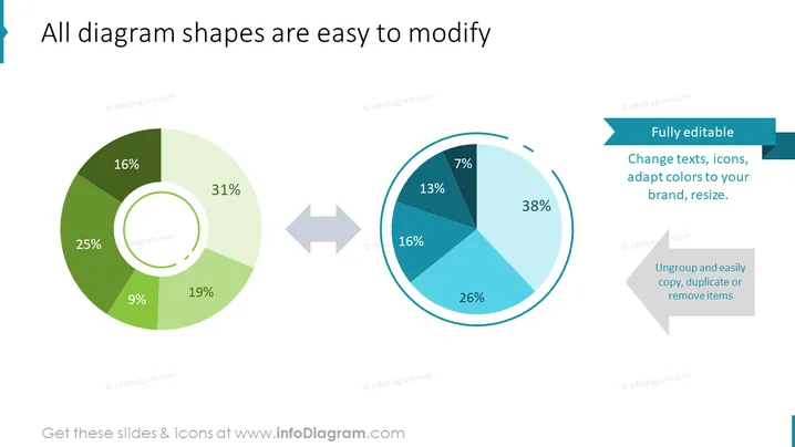
The slide presents the concept that diagram shapes can be modified with ease, showcasing two pie charts to illustrate the point. On the left, a pie chart displays percentages such as 31%, 25%, 19%, 16%, and 9%, categorizing different segments with color shades of green. An arrow pointing to the right introduces another pie chart on the right, reinforcing the transformation aspect by showing different percentages and color shades. The change suggests adaptability in data presentations. Text boxes also imply features like full editability, advising viewers that texts, icons, and colors can be adjusted to fit different brands or requirements and items can be ungrouped for easy manipulation.
The overall look is professional and modern, utilizing a contrast of colors to differentiate between various elements. The transition representation with arrows creates a visual link, emphasizing the adaptability of the chart elements.


