Your graphics add a nice touch to my presentations and I recently used them for one of my all-hands meetings. Your toolbox adds professionalism to my slides. Instead of using standard clipart.
Claude Jones, Director of Engineer, @Walmartlabs, USA
Your graphics add a nice touch to my presentations and I recently used them for one of my all-hands meetings. Your toolbox adds professionalism to my slides. Instead of using standard clipart.
Claude Jones, Director of Engineer, @Walmartlabs, USA
I needed a fresh look at some of my slides. I've tried to find a way to create a paintbrush effect, to underline, accentuate, add some color and the handwritten markers were just the things. Very easy to use, easy to size, change the color. It was an affordable, perfect solution and I'm happy to recommend it.
Anonymous, US
The crisp, clean look of the graphics, and the fact that it allowed me to easily edit and change the colors to match the template was my main reason for purchasing them.
Brandie Jenkins, E-learning Developer, USA
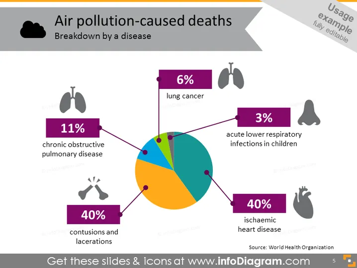
The slide presents a statistical breakdown of air pollution-caused deaths by disease. The information is illustrated in a pie chart format. The largest segment, at 40%, is attributed to ischaemic heart disease, underscoring the significant impact of air pollution on heart health. Another 40% is shared by contusions and lacerations, indicating trauma as a comparable cause. Chronic obstructive pulmonary disease accounts for 11%, spotlighting its relevance in air pollution-related mortality. Lung cancer and acute lower respiratory infections in children represent 6% and 3% respectively, emphasizing their smaller but notable shares.
The slide possesses a clean, professional look with a clear, easy-to-read font. The use of distinct colors and corresponding icons aids in quickly conveying the information.


