Your graphics add a nice touch to my presentations and I recently used them for one of my all-hands meetings. Your toolbox adds professionalism to my slides. Instead of using standard clipart.
Claude Jones, Director of Engineer, @Walmartlabs, USA
Your graphics add a nice touch to my presentations and I recently used them for one of my all-hands meetings. Your toolbox adds professionalism to my slides. Instead of using standard clipart.
Claude Jones, Director of Engineer, @Walmartlabs, USA
I needed a fresh look at some of my slides. I've tried to find a way to create a paintbrush effect, to underline, accentuate, add some color and the handwritten markers were just the things. Very easy to use, easy to size, change the color. It was an affordable, perfect solution and I'm happy to recommend it.
Anonymous, US
The crisp, clean look of the graphics, and the fact that it allowed me to easily edit and change the colors to match the template was my main reason for purchasing them.
Brandie Jenkins, E-learning Developer, USA
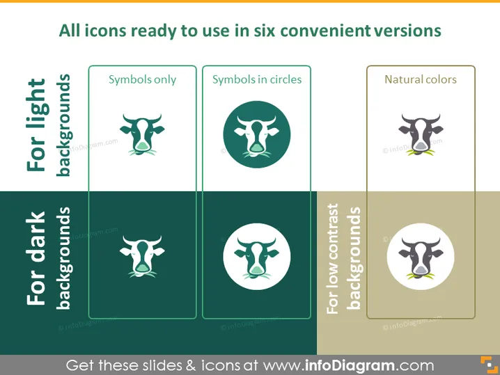
The PowerPoint slide presents a collection of icons available in six different styles for varied background settings. "Symbols only" signifies a basic icon with no additional design elements, suitable for any usage where a clear, unobstructed symbol is needed. "Symbols in circles" encapsulates the icon within a circle, providing a contained visual that can help in distinguishing the icon from surrounding content. "Natural colors" depict the icon in a realistic color palette, which could be utilized for a more authentic or organic representation. The other three styles are specialized for different backdrops: for light backgrounds, for dark backgrounds, and for low contrast backgrounds, each showing the same icon optimized for visibility against these specific background types.
The PowerPoint slide employs a clean and modern design with a balance of colors and elements to showcase icon variations effectively. The use of colored blocks and shadow effects on the rectangles creates a structured and appealing visual hierarchy.


