Your graphics add a nice touch to my presentations and I recently used them for one of my all-hands meetings. Your toolbox adds professionalism to my slides. Instead of using standard clipart.
Claude Jones, Director of Engineer, @Walmartlabs, USA
Your graphics add a nice touch to my presentations and I recently used them for one of my all-hands meetings. Your toolbox adds professionalism to my slides. Instead of using standard clipart.
Claude Jones, Director of Engineer, @Walmartlabs, USA
I needed a fresh look at some of my slides. I've tried to find a way to create a paintbrush effect, to underline, accentuate, add some color and the handwritten markers were just the things. Very easy to use, easy to size, change the color. It was an affordable, perfect solution and I'm happy to recommend it.
Anonymous, US
The crisp, clean look of the graphics, and the fact that it allowed me to easily edit and change the colors to match the template was my main reason for purchasing them.
Brandie Jenkins, E-learning Developer, USA
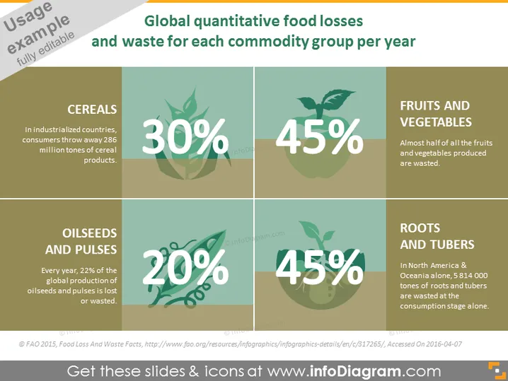
The PowerPoint slide presents statistics on the food losses and waste percentages for various commodity groups, a critical issue in global sustainability. "CEREALS" shows a 30% loss where consumers in industrialized countries discard 286 million tons of cereal products, highlighting significant wastage in staple foods. With "FRUITS AND VEGETABLES," the waste is more alarming at 45%, denoting that nearly half the produce is thrown away. For "OILSEEDS AND PULSES," the waste is at 20%, which signifies that a fifth of the global production of these crops is lost or wasted. The "ROOTS AND TUBERS" section also shows a 45% waste, particularly pointing out that over five million tons in North America and Oceania are wasted just at consumption.
The overall look of the slide is clean and modern, with a focus on visual hierarchy to present statistical information clearly and effectively. The use of colors, icons, and large text works together to create an engaging visual summary of the data.


