Your graphics add a nice touch to my presentations and I recently used them for one of my all-hands meetings. Your toolbox adds professionalism to my slides. Instead of using standard clipart.
Claude Jones, Director of Engineer, @Walmartlabs, USA
Your graphics add a nice touch to my presentations and I recently used them for one of my all-hands meetings. Your toolbox adds professionalism to my slides. Instead of using standard clipart.
Claude Jones, Director of Engineer, @Walmartlabs, USA
I needed a fresh look at some of my slides. I've tried to find a way to create a paintbrush effect, to underline, accentuate, add some color and the handwritten markers were just the things. Very easy to use, easy to size, change the color. It was an affordable, perfect solution and I'm happy to recommend it.
Anonymous, US
The crisp, clean look of the graphics, and the fact that it allowed me to easily edit and change the colors to match the template was my main reason for purchasing them.
Brandie Jenkins, E-learning Developer, USA
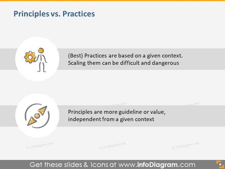
The slide presents a comparison between "Principles" and "Practices". It states that practices are context-specific and scaling them may pose challenges and risks, implying that best practices are often tailored to particular situations and may not be universally applicable. In contrast, principles are described as being more like guidelines or values that are not dependent on any specific context, suggesting that they have a broader application and can guide behavior or decision-making in a variety of situations.
The overall look of the slide is clean and modern with a minimalist design. The icons are simple yet effective in conveying abstract concepts visually.


