Your graphics add a nice touch to my presentations and I recently used them for one of my all-hands meetings. Your toolbox adds professionalism to my slides. Instead of using standard clipart.
Claude Jones, Director of Engineer, @Walmartlabs, USA
Your graphics add a nice touch to my presentations and I recently used them for one of my all-hands meetings. Your toolbox adds professionalism to my slides. Instead of using standard clipart.
Claude Jones, Director of Engineer, @Walmartlabs, USA
I needed a fresh look at some of my slides. I've tried to find a way to create a paintbrush effect, to underline, accentuate, add some color and the handwritten markers were just the things. Very easy to use, easy to size, change the color. It was an affordable, perfect solution and I'm happy to recommend it.
Anonymous, US
The crisp, clean look of the graphics, and the fact that it allowed me to easily edit and change the colors to match the template was my main reason for purchasing them.
Brandie Jenkins, E-learning Developer, USA
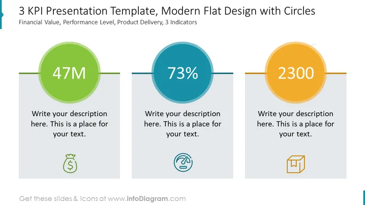
The slide provides a visual representation of three Key Performance Indicators (KPIs), each depicted within a differently colored circle. "47M" represents a financial value metric, suggesting a monetary figure such as revenue or budget, usually critical for financial reporting or goal setting. "73%" is a performance level indicator, possibly referring to efficiency, completion rate, or customer satisfaction, essential for performance management. "2300" could denote a product delivery metric, like units sold or shipped, significant for operational and sales strategies. Placeholder text beneath each KPI suggests where additional explanations can be added.
The slide is clean and modern, using flat design principles with simple shapes and minimalistic icons. The design is focused on clarity and ease of understanding, with bold figures in each circle capturing immediate attention.


