Your graphics add a nice touch to my presentations and I recently used them for one of my all-hands meetings. Your toolbox adds professionalism to my slides. Instead of using standard clipart.
Claude Jones, Director of Engineer, @Walmartlabs, USA
Your graphics add a nice touch to my presentations and I recently used them for one of my all-hands meetings. Your toolbox adds professionalism to my slides. Instead of using standard clipart.
Claude Jones, Director of Engineer, @Walmartlabs, USA
I needed a fresh look at some of my slides. I've tried to find a way to create a paintbrush effect, to underline, accentuate, add some color and the handwritten markers were just the things. Very easy to use, easy to size, change the color. It was an affordable, perfect solution and I'm happy to recommend it.
Anonymous, US
The crisp, clean look of the graphics, and the fact that it allowed me to easily edit and change the colors to match the template was my main reason for purchasing them.
Brandie Jenkins, E-learning Developer, USA
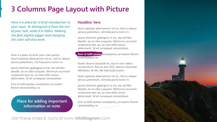
Slide Content: The slide is titled "3 Columns Page Layout with Picture" suggesting an organizational structure that divides content into three sections for clarity. A brief introduction differentiates itself in italics, hinting at the usage of typographical emphasis to highlight key information. Each column provides space for main points, emphasized by italics to denote significance, and showcases how to convey details in a structured and clear manner. There is a dedicated area for adding essential notes or information, pointing to the importance of side notes in presentations.
Graphical Look:
The slide is visually balanced, with text complementing the bold image on the right. The clear demarcation of text and image areas enables easy digestion of information while providing a visually appealing contrast.
Use Cases:


