

Your graphics add a nice touch to my presentations and I recently used them for one of my all-hands meetings. Your toolbox adds professionalism to my slides. Instead of using standard clipart.
Claude Jones, Director of Engineer, @Walmartlabs, USA

Your graphics add a nice touch to my presentations and I recently used them for one of my all-hands meetings. Your toolbox adds professionalism to my slides. Instead of using standard clipart.
Claude Jones, Director of Engineer, @Walmartlabs, USA
I needed a fresh look at some of my slides. I've tried to find a way to create a paintbrush effect, to underline, accentuate, add some color and the handwritten markers were just the things. Very easy to use, easy to size, change the color. It was an affordable, perfect solution and I'm happy to recommend it.
Anonymous, US
The crisp, clean look of the graphics, and the fact that it allowed me to easily edit and change the colors to match the template was my main reason for purchasing them.
Brandie Jenkins, E-learning Developer, USA
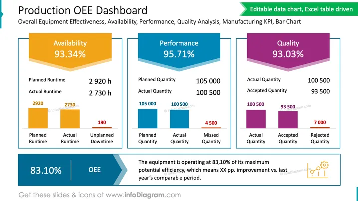
The PowerPoint slide is titled "Production OEE Dashboard" and delves into three key performance indicators (KPIs) for manufacturing: Availability, Performance, and Quality. Availability is at 93.34% with details on planned vs. actual runtime, leading to 190 hours of unplanned downtime. Performance measures at 95.71%, indicating a small shortfall between planned and actual production quantities. Finally, Quality stands at 93.03%, describing the accepted quantity of products versus rejected ones after a quality check. The overall equipment effectiveness (OEE) is evaluated at 83.10%. The slide includes a footnote stating an improvement over the previous year's period.
The slide is visually clean and uses contrasting colors to differentiate between sections, making the information easy to digest at a glance. The use of bars and bold percentages draws attention to the key metrics.
The slide is focused on a "Production OEE Dashboard" displaying Overall Equipment Effectiveness including aspects such as Availability, Performance, and Quality Analysis. The Availability section shows a KPI of 93.34%, breaking down the planned runtime (2,920 hours) against actual runtime (2,730 hours), resulting in 190 unplanned downtime hours. Performance is noted at 95.71%, with planned quantity (105,000 units) compared to actual quantity produced (100,500 units), accounting for 4,500 units missed. The Quality segment indicates a 93.03% success rate, contrasting actual quantity (100,500 units) with accepted quantity (93,500 units), highlighting 7,000 rejected units. The OEE benchmark is indicated at 83.10%, suggesting room for improvement.
The slide employs a professional and clean design with distinct blocks of color and clear graphical elements that make interpreting the data intuitive. The layout is well-organized, with visual cues that guide the viewer through the various metrics and their ## Production OEE Dashboard
The "Production OEE Dashboard" slide provides an overview of a manufacturing system's Overall Equipment Effectiveness (OEE), detailing three main components: Availability (93.34%), Performance (95.71%), and Quality (93.03%). The Availability segment outlines the planned and actual runtime, with a visual emphasis on the difference termed 'Unplanned Downtime'. Performance compares the planned and actual quantities of production, noting the shortfall as 'Missed Quantity'. Quality contrasts the actual quantity produced with the accepted quantity post-quality check, highlighting the 'Rejected Quantity'. The slide culminates in an OEE score of 83.10%, with a footnote remarking on an efficiency improvement from the last year. Each section includes bar charts and numerical data supporting the visualized KPIs.
This slide is aesthetically organized, using color-blocking to segment different KPIs and utilizing bar charts for clear data comparison. The contrasting colors and design elements create a visually effective summary of equipment performance metrics.
The slide titled "Production OEE Dashboard" encompasses critical metrics of manufacturing effectiveness, presenting Overall Equipment Effectiveness (OEE) and its underlying components. Availability is showcased at 93.34% based on planned versus actual runtime, with an explicit callout of unplanned downtime. Performance is depicted at 95.71%, comparing planned to actual production quantities, highlighting the missed quantity. Quality comes in at 93.03%, contrasting actual production quantity with the accepted amount post-inspection, which in turn reveals the rejected quantity. The slide suggests a current OEE of 83.10%, a performance improvement when compared to the previous year, illustrated via a bar graph and annotated metrics.
The slide has a clean, professional look with a well-structured layout that uses color to differentiate between sections and graphical elements such as bar charts and bold fonts to highlight key data, making it easy to understand at a glance.
The slide outlines the "Production OEE Dashboard," which covers the Overall Equipment Effectiveness (OEE) across three categories: Availability, Performance, and Quality. Availability is noted at 93.34%, showing a difference between Planned and Actual Runtime, leading to unplanned downtime. Performance is at 95.71%, with a slight deficit between Planned and Actual Quantity produced. Quality has a 93.03% rate, detailing the Actual and Accepted Quantity, which alludes to the rate of rejected products. The slide rounds off with an OEE of 83.10% and includes a comment on equipment efficiency improvement compared to the previous year.
The slide uses color-coded sections to differentiate and emphasize important data points. The design is clear and structured, enabling ease of interpretation of complex metrics through the use of visual elements such as bar charts and contrasting colors.



