

Your graphics add a nice touch to my presentations and I recently used them for one of my all-hands meetings. Your toolbox adds professionalism to my slides. Instead of using standard clipart.
Claude Jones, Director of Engineer, @Walmartlabs, USA

Your graphics add a nice touch to my presentations and I recently used them for one of my all-hands meetings. Your toolbox adds professionalism to my slides. Instead of using standard clipart.
Claude Jones, Director of Engineer, @Walmartlabs, USA
I needed a fresh look at some of my slides. I've tried to find a way to create a paintbrush effect, to underline, accentuate, add some color and the handwritten markers were just the things. Very easy to use, easy to size, change the color. It was an affordable, perfect solution and I'm happy to recommend it.
Anonymous, US
The crisp, clean look of the graphics, and the fact that it allowed me to easily edit and change the colors to match the template was my main reason for purchasing them.
Brandie Jenkins, E-learning Developer, USA
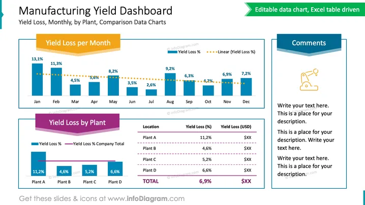
This PowerPoint slide titled "Manufacturing Yield Dashboard" presents a comparison of yield loss data across different time periods and locations. The first chart, "Yield Loss per Month," illustrates the percentage of yield loss for each month, with the percentages decreasing over the year. The decreasing trend is emphasized by a dotted line that represents a linear trend of the yield loss percentages. The second chart, "Yield Loss by Plant," contrasts yield loss percentages and dollar values across four different plant locations, highlighting the variance in performance. A side panel titled "Comments" provides space for additional notes, which could be used to explain the data or suggest actionable insights.
The slide features a coherent and professional design with a well-organized structure that visually separates data for ease of understanding.



