
Your graphics add a nice touch to my presentations and I recently used them for one of my all-hands meetings. Your toolbox adds professionalism to my slides. Instead of using standard clipart.
Claude Jones, Director of Engineer, @Walmartlabs, USA

Your graphics add a nice touch to my presentations and I recently used them for one of my all-hands meetings. Your toolbox adds professionalism to my slides. Instead of using standard clipart.
Claude Jones, Director of Engineer, @Walmartlabs, USA

I needed a fresh look at some of my slides. I've tried to find a way to create a paintbrush effect, to underline, accentuate, add some color and the handwritten markers were just the things. Very easy to use, easy to size, change the color. It was an affordable, perfect solution and I'm happy to recommend it.
Anonymous, US
The crisp, clean look of the graphics, and the fact that it allowed me to easily edit and change the colors to match the template was my main reason for purchasing them.
Brandie Jenkins, E-learning Developer, USA
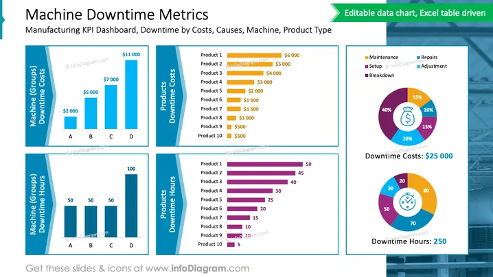
The slide titled 'Machine Downtime Metrics' details a manufacturing KPI dashboard, focusing on downtime by costs, causes, machine, and product type. It presents four bar graphs, each depicting different aspects—machine groups' downtime costs, products' downtime costs, machine groups' downtime hours, and products' downtime hours. Each bar graph expands on a unique aspect: the financial impact of downtime (Machine Groups Downtime Costs), the financial impact per product (Products Downtime Costs), the downtime duration (Machine Groups Downtime Hours), and the downtime duration per product (Products Downtime Hours). Additionally, two pie charts show the percentage distribution of downtime causes and cumulative downtime costs and hours.
The overall look of the slide is clean, professional, and data-centric, promoting easy readability. Each visual element serves to break down complex downtime data into digestible segments for straightforward analysis.


