

Your graphics add a nice touch to my presentations and I recently used them for one of my all-hands meetings. Your toolbox adds professionalism to my slides. Instead of using standard clipart.
Claude Jones, Director of Engineer, @Walmartlabs, USA

Your graphics add a nice touch to my presentations and I recently used them for one of my all-hands meetings. Your toolbox adds professionalism to my slides. Instead of using standard clipart.
Claude Jones, Director of Engineer, @Walmartlabs, USA
I needed a fresh look at some of my slides. I've tried to find a way to create a paintbrush effect, to underline, accentuate, add some color and the handwritten markers were just the things. Very easy to use, easy to size, change the color. It was an affordable, perfect solution and I'm happy to recommend it.
Anonymous, US
The crisp, clean look of the graphics, and the fact that it allowed me to easily edit and change the colors to match the template was my main reason for purchasing them.
Brandie Jenkins, E-learning Developer, USA
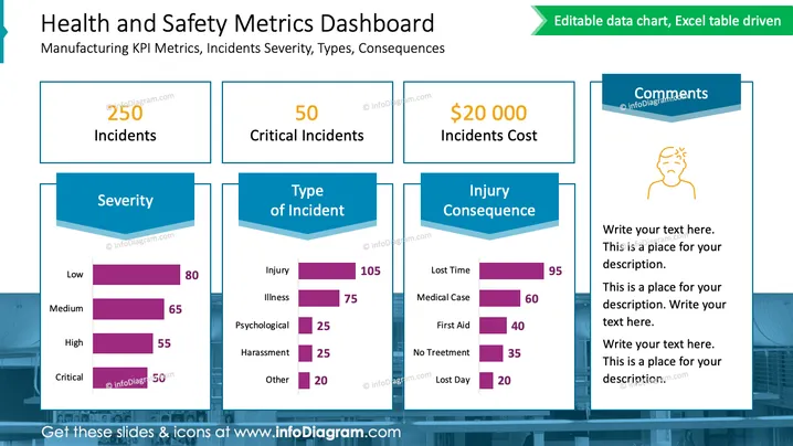
This PowerPoint slide titled "Health and Safety Metrics Dashboard" presents a summary of key performance indicators (KPIs) for manufacturing health and safety. It includes metrics on the total number of incidents (250), critical incidents (50), and the cost associated with these incidents ($20,000). Additionally, it provides a breakdown of incidents by severity (Low, Medium, High, Critical), type (Injury, Illness, Psychological, Harassment, Other), and consequence (Lost Time, Medical Case, First Aid, No Treatment, Lost Day). Each of these metrics is represented by a horizontal bar graph, with different shades of purple indicating the counts of each category.
The overall look of the slide is polished and organized, utilizing a cohesive color scheme and clear graphical representations for data, making it easy to comprehend at a glance.



